Categories

social media

Is IGTV the right fit for your business?

“Instagram turns its’ gaze to video content creators with the new IGTV app.”

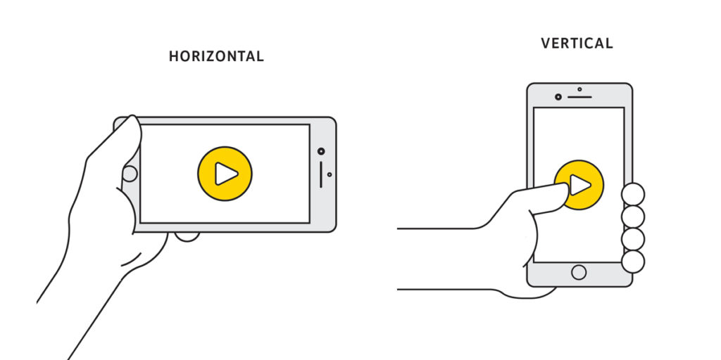
Most people use their smartphone in vertical mode most of the time and they want content in this format as well. So Instagram has launched IGTV (short for Instagram TV), a new app for watching long-form vertical videos. This can be done via the new IGTV app or within the regular Instagram app. Jump down to watch our walk-through video.

It’s safe to say that IGTV is definitely making waves in the social world and users are keen to consume and produce longer form video. The IGTV app already has 1+ million downloads on Google Play. This doesn’t include users who downloaded the app via iTunes (data not yet available) or those who are using IGTV through their regular Instagram app which now has 1 billion active users monthly.

“People have been watching 60% more video on Instagram over the last year.”

It seems that the Facebook-Instagram dynamic duo is aiming to take over the video world. With this new video format, Instagram is going up against YouTube and Snapchat’s Discover section. (When it comes to TV or Netflix type video, that’s where the new Facebook TV comes in but that is for another discussion.)

Is Long-form Mobile Video the Way to Go?

With waning attention span and exponentially growing content, will users actually consume videos that are up to one-hour longer and mobile-only? Instagram is betting yes. Longer videos certainly work on YouTube but it offers videos on desktop as well as mobile. Let’s take a look at some data.

According to a recent study, mobile is the preference for short-form videos, “… 82% preferred mobile, 56% computers, and only 13% traditional and connected TVs.” (https://www.iab.com/insights/personal-prime-time/). While not stated explicitly in this study, we must assume that short videos is anything shorter than a traditional TV episode since long videos were described as traditional TV episodes.

A 2016 study showed that on YouTube specifically, users watched a higher number of videos and spent more time overall on mobile, however they spent more time watching an individual video on desktop.

Based on these metrics, we know users are more and more likely to watch video content on their phones but time will tell if this is the case with long-form video as well.

Wooing the Content Creators

Instagram has gained the backing of popular creators to help showcase the new IGTV.  Currently, many of these creators use Instagram to gain a following and increase exposure. They host their actual shows on YouTube and simply link to them from their Instagram accounts.

We see a few challenges when it comes to wooing the content creators over to the IGTV side. First, YouTube videos are exclusively horizontal, whereas the IGTV videos are vertical. Will creators choose one channel over the other? Will they go through the extra work to produce videos in two formats?

Second, IGTV is currently not showing ads. This could be a problem since creators make money from their YouTube accounts based on the ads shown on their videos. With no ads running on IGTV, it looks like creators don’t have a direct way to generate revenue. They certainly can link off to other paid content or even to their YouTube videos but this still could be a large barrier for stealing creators away from YouTube.

Regarding ads, Instagram CEO Kevin Systrom said, “…that’s obviously a very reasonable place to end up. There will be a way for creators to make a living.” But until that happens, creators won’t know exactly what’s in store for them and how they can use their new channel as a revenue stream.

We’re excited to see what shifts happen in the coming weeks after the initial excitement of the launch.

So, What is IGTV Actually Like?

Video Format
Videos are full screen and vertical. Technically, you can upload landscape videos but they will be displayed with blurred top and bottom to fit within the screen or will be displayed sideways and you’ll have to turn your phone to view (not ideal). Regular Instagram currently lets you post slightly vertical, square or landscape videos (it will crop vertical videos down).
Video Length
Videos on the IGTV can be up to one hour long for large accounts.  It looks like most accounts have a 10 minute max for now; we expect that video length will increase for most accounts in the future.

Some Benefits for Marketers

ideos start playing automatically as soon as you open IGTV. You’ll be served videos from people you already follow on the Instagram app as well as others as well as suggest video based on your interests. Since your videos will be shown to people who don’t necessarily follow you, this gives brands a chance to captivate new audiences.

Again, there is currently no advertising space available, but we are fairly confident it’s on its’ way.

As we mentioned above, one issue may be repurposing content. If you shoot full-screen video for your IGTV channel, you’ll need to do some seriously creative cropping or shoot completely new footage for your YouTube channel.[/vc_column_text][vc_column_text]

So, Should You Jump on the IGTV Train?

When it comes to choosing which social channels to be on, our advice is always the same.

  1. Go where your audience is. Instagram is especially great for reaching Millennials — which by the way are 22 to 37 year-olds as of 2018 — and is tied with LinkedIn as the second most popular social media network for Canadians. (https://cira.ca/factbook/canada%E2%80%99s-internet-factbook-2018)
  2. Start small, then add new channels only once you’ve mastered your current ones.

This goes for new apps within other apps. We suggest focusing on one aspect of Instagram, like your regular Instagram feed, before moving on to Stories or IGTV. You don’t need to do them all, but if you’re already rocking it and have the manpower to give IGTV a try, we fully support it.

Want to watch the announcement video? Check it out here: https://www.instagram.com/tv/BkQjCfsBIzi/

Categories

digital marketing - social media

Cross Channel Marketing

“There is a place in the buyer journey for multiple platforms.”

When was the last time you bought a product or service after seeing it advertised for the first time? For most of us, we see products multiple times before we buy. We see ads on the Internet, or in magazines. We search for more information online and we see ads following us after visiting websites. Then, often times, we buy. So, if we know our consumers are actively exposed to content on multiple platforms, we should be building and executing strategies for all touch points.

Here is an example of someone moving through the buyer journey on a multi-platform experience.

Let’s set the scene:


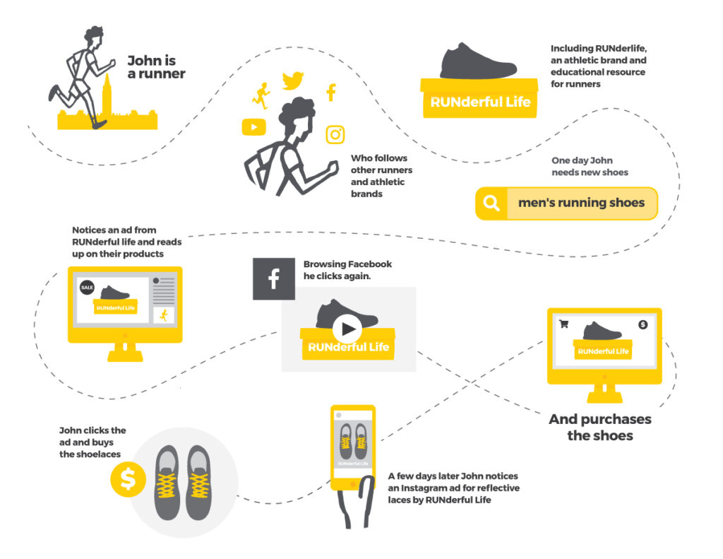
John is a sales rep, bacon-lover, and an avid runner living in Ottawa. After a long day of stressful work, often keeping him at the office much later than 5pm, John likes to go for an evening jog in his neighbourhood. Since running is one of his main interests, John follows a lot of sports brands on social media and is interested in learning about the latest running techniques and equipment.

Enter a company that sells running shoes and other running equipment. Let’s call them It’s a RUNderful Life. They know that their audience is not just looking for fancy equipment, they really want to learn more about running. They produce weekly blog posts and videos that educate and entertain their audience, all on the subject of running. Their aim? To create a fanbase of loyal customers and would-be-customers that value them not just as a company, but as a resource.[/vc_column_text][vc_column_text]John realizes his running shoes have holes in them and it’s time for a new pair. He goes to Google and, after searching “men’s running shoes”, sees a number of ads promoting similar looking running shoes. He notices one of the ads is from a company he follows on social media: It’s a RUNderful Life. He clicks their paid ad promoting a sale for running shoes. He reads up on the offer, but isn’t quite ready to buy yet, so he leaves the site.

The next day, he is browsing Facebook when video ad for the same running shoes he looked at yesterday crosses his newsfeed. John is compelled to click on the ad and, finally, he buys the shoes.

A few days after his purchase, John is scrolling through his Instagram feed and notices an ad for shoelaces that are reflective in the dark and are perfect for nighttime runners. The ad shows the shoelaces being used with the running shoes that John had bought earlier in the week. He clicks on the ad and decides to buy the shoelaces.

So, what’s the advertising story behind this scenario?

Cross Channel Marketing Infographic

First, It’s a RUNderful Life is using content marketing in addition to paid advertising. By creating frequent and consistent content, they are attracting potential customers to become familiar with their brand. They’re also keeping current customers interested and primed for future purchases. Consistent content keeps the company top of mind and builds trust with its audience.

The content marketing play works beyond social media as well. Search Engine Optimization (SEO) can play a huge role in the buyer journey. Before making a purchase how often do you Google it first?

Buyers may have identified a problem and are looking for solutions, not actual products. This is where your web content, like blogs and other resources, can help capture their attention. Instead of searching for “men’s running shoes”, John may have searched for “best men’s running shoes” first. In which case, a blog listing different shoes and their benefits would be a great way to introduce your brand to potential buyers, increase trust, and start building a retargeting audience of people who have visited your site.

In addition to organic promotion through content marketing, It’s a RUNderful Life is advertising on Google using AdWords. The company is using a retargeting audience of people who have visited their website to serve ads on Facebook. Lastly, the company has created an audience of customers on Facebook and Instagram with which to upsell and cross-sell to — like a follow up after the purchase. This is why John was served the shoelaces ad on Instagram.

By examining the buyer journey, we can pick out the best platforms and messages to reach potential customers at specific points in the buyer journey.

Content marketing can help put your business on your audience’s radar. Display ads, like GDN or Facebook videos are great ways to build awareness, especially for products or services that a user may not know they need. Search ads can help capture potential customers who are looking for what you offer.

But how does that actually work?

It may seem like magic when you start seeing ads for shoes you were thinking about last week, but the truth is that those ads are being served to you based on a very real little bit of code called a pixel.

You a pixel add to your website which sends information back to the pixel’s source, in this case Facebook and Google. The pixels can report a lot of different information that can be useful to advertisers, and not just for retargeting.

The pixel ‘fires’ (which is what we call it when the pixel sends info back to the source) when a person lands on a page, which allows us to track page visits. This is how we knew that John had visited the running shoes page, but didn’t buy. Not only can you tell what pages someone visited, you can tell what pages they didn’t visit. The pixel ‘fired’ when John his the running shoes page but since the pixel on the checkout page never fired, we know he didn’t buy the shoes. So we told Facebook to serve John (and anyone else who also visited the running shoes page but NOT the checkout page) the video ad featuring the running shoes.

Pixels allow advertising platforms like Facebook and Google to offer conversion tracking and conversion goals.

You can set up rules within the advertising platforms that tell them what a conversion is. Our video ad on Facebook could so we can see right within the Ad Manager how many conversions (purchases) the ads have generated. This is especially useful if you are split testing different ad creative — you can see which specific ad is generating the most conversions, not just link clicks.

Knowing who has converted is also useful for our retargeting rules. For our example, our video ad that features the running shoes on Facebook is served to people who view the running shoes page but don’t checkout. Obviously, once they do checkout and buy the shoes we don’t want to keep serving them ads to buy the shoes. So we can use the pixel to stop playing ads to people who have visited certain pages as well. Once John buys the shoes, he no longer sees the video ad. Then, we move John over to our cross-sell audience for the shoelaces.

While these examples are using the Facebook platform and pixel, the Google pixel works the same. Pixels and their capabilities will vary from platform to platform. The Reddit pixel doesn’t allow you to do retargeting (yet!) but it does give you information about people who have seen your ads and visited your site.

When building out your retargeting audiences, make sure to look up what the capabilities of the pixels are on the platforms you are using so you don’t get yourself into a pickle.

We’re advertising on multiple platforms, so aren’t we already doing this?

If you have the budget, you are probably already advertising on multiple channels and platforms. However, many marketers are using these channels in silos, working independently of each other. When agencies develop a true cross-channel marketing strategy, they look at the buyer’s journey across all channels and platforms and create touch points that work together.

At Alphabet, we’re constantly reviewing the best practices and ensuring we’re driving our client’s messages through the appropriate channels. This often means thinking outside the box — as we’re fond of doing — to find new ways to make new uses of a channel or platform.

Categories

campaigns - social media

Reddit? Did it. Crushed it!

What is Reddit?

Reddit is a social media platform that is the self-proclaimed “front page of the internet.” The website has a very simple build and, at first glance, you may not believe it’s a thriving internet community of 234 million unique users (as of 2017).

It’s organized into Subreddits, which are unique forums based on interests. You may be surprised at how niche these Subreddits can get. They range from broad topics like “r/History” to the hyper-specific “r/SweetBagelHate: Bagels are fundamentally a savoury food” (which has 327 subscribers, believe it or not).

Reddit is home to a diverse crowd but is a definite favourite of tech-savvy users. That’s why we decided to test out the advertising feature for our client, the Canadian Internet Registration Authority.

An Educated Gamble – But a Gamble Nonetheless!

The Canadian Internet Registry Authority (CIRA) was looking for new ways to reach Canadians to build awareness of the .CA brand and ultimately purchase .CA domain names. When considering Reddit, we realized our message aligned well with the platform’s audience and the options for using Subreddits to target was appealing.

However, we were hesitant about the ad format since Reddit only allows text ads on the desktop website and text or image for the mobile site (depending on what view the user has chosen to use on mobile). CIRA has a fabulous brand with great imagery that has been working well on other platforms and pulling in great results with video. The plain format ads on Reddit felt like a step backward. We wanted to branch out to another platform, and CIRA was very interested in testing a different platform and market to expand their reach. So, we gave Reddit advertising a try.

The Campaign

We launched our first campaign in June of 2017. The ads ran for ten days, and we targeted Canadians on the front page of Reddit and throughout the site. We continued with our themes of “Choose Canada, Choose .CA” and “The Internet Needs More Canada”. With the visual pieces, we used iconic Canadian imagery along with these messages. For the text ads, we used our .CA logo for the thumbnail and similar messaging in the post copy.

CIRA Reddit Ad
CIRA Reddit Ad

The Results

The results were very encouraging. The Reddit platform offered an incredibly low Cost Per Thousand Impressions (CPM) which allowed us to deliver 3.7 million impressions in those ten days.

CIRA Reddit Marketing Results

With the success of our first foray into the Redditsphere, we decided to double down and go full tilt for July. Our July campaign ran for the full month and generated some excellent results.

CIRA Reddit Marketing Results

Keep on Keepin’ On

The results of our first campaigns with Reddit confirmed what we had suspected: that Reddit was a fantastic space for CIRA to advertise and spread awareness of the .CA TLD.

Our Reddit ads have been running steadily since June and have accumulated a wealth of leads.

CIRA Reddit Marketing Results

The Reddit advertising platform continues to grow and update with new features, and we’re excited to see how we can leverage this platform for more growth with CIRA and our other clients.

So, what did we learn?

New platforms, channels and ways to reach to reach your customers are appearing all the time. Some may not be new – but they can be new to you! The Internet is all about dynamic change – it’s the only constant. So, get out there and embrace the risk … go on … give it a big ol’ hug!

Categories

web design

Speed Matters – Website Performance and Perception

Every organization wants a beautiful website and there is no question that a well-designed website has a huge impact on how your business or organization is perceived. Something that is not as obvious at first glance is how much of an impact the speed and performance of your website can have on its ultimate effectiveness. Here is an overview of the real world impacts of good performance and what you need to know when striving for the best web experience for your visitors.

A fast and well-performing site might seem like a foregone conclusion, but you’d be surprised just how big of an effect it can have on your organization’s success:

  • Amazon looked at the issue and found that each additional 1/10th of a second of load time corresponded with a 1% reduction in sales.
  • Walmart found that for every second they improved their page load times they added an additional 2% to their conversion rate.

These numbers reveal that even a small change in your website performance can improve its effectiveness significantly.

Web performance isn’t only about improving the conversions on your site. Did you know Google uses the performance of your website as a ranking factor in search results? The perceived speed of your site has a direct connection to how users feel when they use your site. The faster it is, the happier they are. Google wants to give their users the best search results possible, and since a faster site gives a better user experience, Google ranks it higher in the search results.

Faster site = better user experience = higher search ranking = greater success!

So, what can be done to improve page load times?
Many factors come into play when it comes to the performance of your site. It makes sense to evaluate them all when working towards the best possible user experience.

Key areas to consider are:

  • The design of the visual aspects
  • Optimizing the user experience
  • Optimizing the site’s interface to provide instant feedback
  • Keeping graphics optimized for speedy loading
  • Reducing the amount of initial content load

Beyond visual design, it’s important to ensure all systems behind the scenes are optimized as well. Fast servers, fast databases, content caching, and content distribution networks can all be optimized to get that content to your visitors in record time.

Website performance is crucial to your organization’s success. Every member of your web team — from the designers and content strategists, to the copywriters and graphic artists, to the folks running your hosting and programmers coding the site — all have a vital role to play in achieving the best results possible from your online presence.

Categories

design

The Art of Hand Lettering

I’ve been doodling as long as I can remember, much to the chagrin of my teachers, professors, and the general public – to all of you, I swear I’m listening.

Somewhere along the line, these doodles became a career path. Digging deeper into the world of design I became fascinated by the form and function of letters and how they interacted with one another. I began filling sheets of paper, napkins, and bits of envelopes with scribbled words and letters.

However, I live and work in a digital world. Most of the things I read, watch or interact with take place on a screen. Despite being in the midst of an era driven by technology; there is still a hunger for the tangible, the authentic, and the creative. This is where digital hand lettering has found its market. Sport and leisure brands, magazines, cookbooks, signage and countless other applications put this technique in high demand.

Illustrators and typographers like Dana Tanamachi, Lauren Hom and Jon Contino found success thanks to their unique, unrepeatable style. Sought out for their flair for the unexpected, they created work that evoked emotion, interest and support. Hand lettering is all about creativity, quality and the artist’s ability to interpret and communicate the message with a unique approach. Custom lettering is about using the shapes and forms of words and how they interact with one another to make you feel something. It goes beyond just filling space or picking a font. Each letter is a work of art, flowing into the next; each element carefully considered and supporting the one before and behind it.

In general, the power of typography is significant in that it is the most direct tool for communicating the message and driving a point home. Most often the best typography is the kind you don’t notice, and if you do, it’s probably because there’s something wrong with it.

Occasionally though, there are times when the typography is the message, and its form becomes every bit as important as it’s function. In these cases originality and quality are key. The power and authenticity of the form is lost when unique letter forms are repeated excessively.

As the hand made element of design, the “human touch” becomes a more sought after look in design, retailers and companies are searching for a way to cut costs. This has resulted in the birth of fonts and typefaces that have a hand drawn look and feel but are stunted in their diversity of form and character.

While they have their merit – they’re very effective in terms of efficiency and price– they rapidly lose what makes them special when over used. The drawback lies in the uniformity of error. The interest and integrity of the letter forms is lost when the same loop, connecting line or textured shape is repeated too many times. We stop enjoying the overall concept and experience. Instead, we begin picking out patterns and repeated forms, breaking down the actual design until we are no longer enjoying or observing the message or the content as a whole but are tearing it apart piece by piece.

My advice, take the time to create something unique. Something carefully completed, worth sharing, saving or remembering. When you’re good at something it always looks easy, effortless and appears as if it could quickly be repeated or replicated.

Lettering is definitely one of those areas of expertise. While a font seems as if it could accomplish the same thing; the reality is that, that single, elegant sentence or lockup required multiple renditions, thoughtful layout as well as a lot of skill and time. Not to mention the hours of practicing that went into learning how to letter in the first place.

Conclusion, no digitally mastered font collection will truly be able to replicate the feeling and craftsmanship of custom designed content. The written word will never cease to exist and as long as it’s here it might as well be beautiful.

Categories

digital marketing - social media

Investigating TikTok – Alphabet® rises to the challenge – Part 1

We’d love to open this piece up with some TikTok references, but they’ll be outdated before it even goes live. So, we made an account so we can just show you instead.

After our first taste of TikTok, we were hooked. We borrowed more of the team’s time to painstakingly film #CharacterCreation and #RunForIt TikTok challenges with our own Alphabet® spin.

Not sure what you just watched? For those of you still in the dark, TikTok is basically the second coming of Vine — but with more screentime. Users create and edit their own short videos, often accompanied by music, right in the app. It’s a place to have fun and most of the videos feature anecdotes, lip-syncing to music or audio clips, reacting to other TikToks using a unique split-screen feature called “duets”, dancing and Hashtag Challenges. A huge share of the content being produced on TikTok surrounds these Hashtag Challenges. A user or brand will create a dance or task and challenge others to film a version of their own just like we did. Popular challenges have included the DNA Test Challenge where you reveal your DNA results in a video or the Stair Shuffle Challenge which features a specific dance while you climb stairs. As one of the fastest-growing apps on the market today, marketers and brands are taking notice and looking to capitalize on it. But before you spend all your budget on the latest shiny thing — ask yourself, is TikTok really worth your time as a Canadian business?

Stay tuned for Part 2 where we’ll dive into the opportunities for Canadian marketers and brands.