Categories

design

The A to Zs of Brand Design & Brand Development

While it might seem that your brand design is merely a logo and well-matched colours, it’s so much more. It’s the entire character and personality of your enterprise.

Let’s play a game. We’ll give you a word—you tell us what comes to mind:

  • Swoosh
  • Colonel Sanders
  • Mickey D’s
  • Mouse House
  • Beamer

You likely guessed Nike, KFC, McDonald’s, Disney, and BMW. One simple word just conjured up an entire brand portfolio in your mind. It didn’t take much, and those are merely associations.

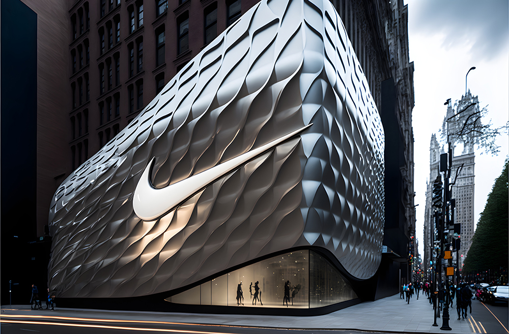
Let’s say you see two sneakers displayed next to each other. One has a checkmark (or swoosh) symbol, and the other has a logo you don’t recognize. Without doing anything, the recognizable brand design automatically earned your trust. Even if you’ve never owned a pair of Nike-anything before, you probably still trust and favour the pair of Nikes over the other shoes. Instant customer favour and trust are what every brand strives toward.

In a highly competitive marketplace across industries, brand development may be more critical now than ever. This guide offers a blueprint for successful brand development and brand design. We uncover how to establish a unique brand personality, create a sense of authenticity, drive trust, and set your business apart from competitors.
What Is Brand Design?

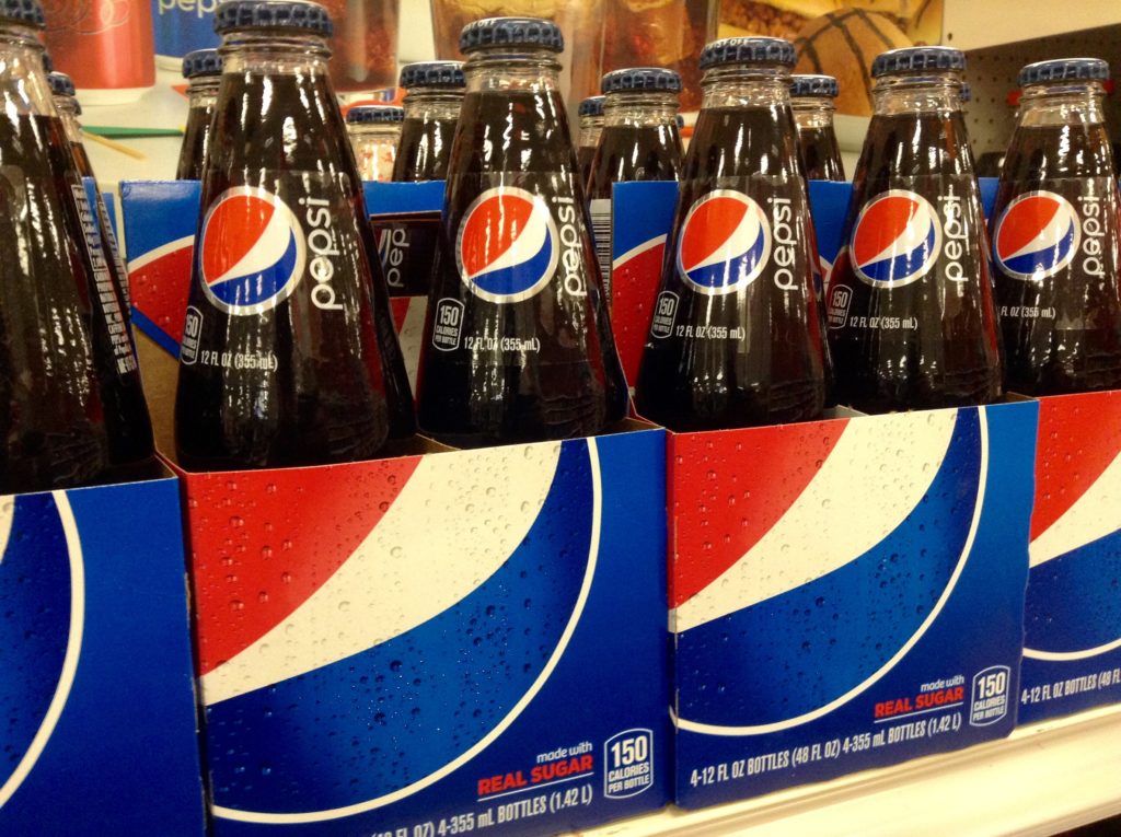
Brand design translates the intangible aspects of your brand personality and values into a recognizable, visual form. Consumers naturally note and remember products with solid branding over those without relatable brand associations. For example, if you see a red soda can, you immediately associate it with Coca-Cola, regardless of whether you see the name “Coca-Cola.” That’s what a strong brand presence does.

A brand design with attractive colours, visual elements, and a distinctive logo makes your brand memorable. Even if someone isn’t ready to purchase your products or services, they’ll remember you. If your branding sticks, you’ll be the one they turn to when they need the product or service you provide.

You must lock in the basics of brand design elements before creating a compelling and consistent brand identity. Then, use them everywhere consumers see your brand, from websites and billboards to social media branding and promotional merchandise.

What Are the Elements of Brand Design?

While brand design is only one part of your brand development, it’s important to remember that this foundational component is your brand’s visual identity. Therefore, every design element should work cohesively to reflect what you stand for.

Logo

Your logo isn’t your brand. It does, however, communicate the ownership, quality, and values your brand holds. It’s imprinted on your marketing, products, social media, and website—and in your customers’ minds.

Your logo is often the first introduction to your brand design and therefore needs to make a solid and accurate first impression. It differentiates you from competitors, validates your professionalism, and has the power to foster loyalty.

So, how do you create a logo design with a deep symbolic association? How do you create a logo that stays in people’s memories and triggers their emotions? Let’s explore more.

Colour Palette

Colour is a fundamental visual stimulus in the sequence of cognition. Even when we’re unaware of it, colours influence our emotions, which affect how we behave as consumers. While different colours generally have specific emotional associations, it’s important to remember that this can vary according to culture, trends, industry, and context. What’s more, colours can have both positive and negative associations.

For example, red is often associated with passion, love, and excitement, but people also connect it with anger. Blue is positively associated with trust, loyalty, and serenity but can also symbolize coldness, depending on how it’s visually applied to other elements.

Keeping context in mind, choose your brand design and logo colours based on the emotions you want to associate with your brand. The colour should tell a story and, more importantly, set you apart from competitors.

While it’s not set in stone, the most influential brands use a simple colour palette of three or fewer solid colours (rather than gradients). Your base colour should reflect your brand’s most dominant personality trait and appeal to your target audience. Next, the accent colour needs to pair well with the other colours while appealing to your audience and matching your brand personality. It’s the trickiest one to pick. Finally, a neutral colour choice serves as a background, so avoid something that draws attention away from the other elements. It is usually off-white, light grey, white, or beige. When used in the right way, black can also be an option.

Whichever colours you choose, it’s important to remember that colours appear differently in print than on screen. So, make sure you can accurately replicate the colours to maintain consistency.
Imagery & Photography

An image can tell a story, evoke emotion, and express personality—all without a single word. Brand imagery lets you communicate this to your consumers in one second. It can take numerous forms, from photographs and illustrations to social media posts and videos.

Knowing what’s important to your target audience and what they value will help you build trust through your visuals. Consumers crave stories and connections. They do business with people, not brands. Your visuals should therefore bring a human element to your brand design, whether showcasing your best work or expressing your uniqueness. The right imagery makes your brand relatable and your message memorable.

It’s also important to be consistent with your imagery style. Consistency makes your brand easier to recognize, which builds trust.

Typography

You’ve probably heard that how you say something is just as important as what you say. Well, consider typography as how you “say” your brand message. Typography has the power to convey a tone of voice and personality. It can portray elegance, whimsy, playfulness, or professionalism.

When choosing a typeface, ensure the wording is clear and legible, even from a distance. There also needs to be a visual balance with other design elements. It might be time for a change if your typography doesn’t effectively represent quality and professionalism.

Iconography

Iconography serves two purposes: it lets you communicate information universally and helps users navigate complex systems. Icons are easily recognizable—you can instantly convey a message regardless of language or cultural barriers. Because people are generally highly visual, iconography is much more memorable than words.

Design your icons in cohesion with the rest of your brand style and personality and ensure they fit seamlessly into your existing designs. Icons should also clearly suggest the functionality with which they’re associated without your audience having to read the accompanying text.

One mistake companies make is cramming too many icons on their pages. Icon overload decreases the impact of each one and becomes visually overwhelming. Instead, set yourself apart with unique, functional designs that are cleverly implemented but still easy to understand. As a result, your brand will be more recognizable and highly memorable.

Motion & Animation

Motion is impossible to ignore in the interactive space. Even small animations, from blinking cursors to jumping icons, beg the user to interact. Because brands constantly communicate via screens—whether a computer, smart TV, or mobile device—it’s easier than ever to integrate motion graphics into your brand story.

Motion graphics enable you to convey a message or idea more effectively than traditional static images or photographs. Whether used as a single element in a brand or as part of a more extensive multimedia presentation, motion graphics can bring life and depth to any design.

It’s also a powerful way to evoke emotion that leads to action. Since you can program the movements to respond to music, cues, and other elements, animations add more dynamism and energy to a brand. This can create something truly distinctive that sets you apart from competitors.

Important Steps to a Successful Brand Development

Brand development is more than getting a logo and finalizing brand design elements. Before you ever start the brand design process, there are vital steps to work through to create a strategy-driven plan for successful brand development. First, it’s time for some self-discovery. You need to know who you are, what you stand for, and what you want customers to remember you for. Once you have pinned this down, you can start working on designs that convey this message effectively.

Find Your Brand’s Purpose

Every brand needs a purpose. This is what drives your brand design and gives it life; it’s the reason your customers buy from you. Without a purpose, it’s impossible to have an impact.

While consumers in the past made purchase decisions based mainly on their needs, price, and quality, things have changed. Today’s consumers want the businesses they support to have a bigger purpose than driving profits. Customers care about the impact brands have on the world and the environment. To be successful, you need a purpose that resonates with your audience. And you must be able to draw them to the idea that their purchase does more than just obtain goods.

Prospects are more willing to buy from you if they feel you embody and inspire change. In addition, they want to feel that supporting you is a partnership in taking action to make a positive difference in the world.

Consider your company’s values and ethics to define or evolve its brand purpose authentically and sustainably. Go beyond superficiality. Integrity—both internal and public—is essential. At a time when negative news can go viral in seconds, brands face immense scrutiny.

Avoid choosing a current issue when establishing your brand’s purpose. Be honest about what inspires your business. Your purpose must be in sync with your products and services, or it won’t be credible. Keep it simple.

If your brand purpose is obsolete, it’s not too late to update it. Today’s customers are knowledgeable and want brands to evolve as they build their market presence. Therefore, crafting a new purpose is better than sticking with an ineffective one.

How to Identify Your Brand Purpose

Developing your brand purpose should involve input from your employees and various stakeholders. However, it should also align with your customers’ needs and passions. Qualitative research can deepen your understanding of what’s essential to your customers.

Ask yourself what you’re best at or passionate about and what difference you can make. The point at which these answers collide with what matters to your target market is precisely where your purpose lies. If your solutions don’t align, keep working on ideas.

A pet shop, for example, serves customers who are passionate about their pets. They’re good at and passionate about animal care and can make a difference with animal welfare drives, projects, and donations. It’s the perfect collision of matching what they’re good at and passionate about with a purpose that will also appeal to their target audience.

Know Your Target Audience

Defining your target audience is critical to developing an effective brand strategy. It enables you to craft a brand design that appeals to your desired customers. By understanding their needs, preferences, and behaviours, you can develop a brand identity that resonates with them and addresses their pain points. You can also more effectively create a brand personality that aligns with the values and aspirations of your target audience to foster an emotional connection and engagement.

Knowing your ideal audience is necessary to guide your marketing communications. It will serve as a roadmap to the design, personality, and message of your marketing and to which channels will be most effective in reaching prospects. The deeper your understanding of your target market, the more impactful your marketing is. You’ll also maximize your marketing return on investment (ROI).

Going a step further and breaking consumers into distinct segments enables you to focus your marketing efforts on those most likely to engage with specific products or services. Categorizing potential customers for effective marketing typically involves location, purchase behaviour, and demographic factors such as age, race, gender, income, and family stage. With this information, you can effectively send the right marketing message to the right customer at the right time.

Define What Makes Your Brand Stand Out from Competitors

Marketing is essential for any business to succeed and grow. However, you’ll get lost in the crowd if you don’t differentiate yourself from the competition. Having a unique selling point (USP) is crucial in standing out and attracting the right customers. Here are some benefits:

  • A USP helps separate your business from the competition.
  • It gives customers a reason to choose you over competitors.
  • Customers are more likely to remember companies with a clear USP.
  • It can provide customers with an emotional connection to your business.
  • It can also help build trust and loyalty between your business and customers.

When defining your USP for optimal brand development, consider the following:

  • What makes your product or service unique?
  • How do you make customers’ lives better?
  • Why do customers keep coming back to purchase from you?
  • What makes customers stop buying from you?

Analyze competitor ads and marketing messages to see how they position themselves and where you fit into the market. When crafting your USP, it’s also important to know current market trends and what appeals to consumers.

Leverage the Power of Personalization

If you want to create a memorable customer experience, make it personal. Personalization focuses on delivering tailored, meaningful, and relevant customer communications. It enables a business to activate its available data to provide relevant experiences for existing customers and prospects. Every person must feel as if you’re paying attention to their unique needs.

Consumers are tired of feeling like another target or statistic. Instead, they want brands to recognize them as individuals with names and unique needs. They want brands to know what they need before they need it.

As classic marketing disciplines like advertising, prices, and services become more personalized, data and analytics must be at the core of your brand development. You can determine what keeps consumers returning by tracking demographics and how they engage with your products, services, and brand. Then, with relevant feedback and analytics, you can improve retention with automated, on-point, personalized offers.

Craft Your Messaging

Brand messaging is a crucial part of brand development because it’s where your brand design, USP, personality, and purpose all come together. It’s how you communicate all of this to your audience effectively. The challenge is that you only have a second or two to do so. But the good news is that both verbal and non-verbal brand messaging have the power to inspire your audience and motivate them to action.

Develop a brand messaging framework to guide your communication. While a successful messaging framework always focuses on the customer first, it’s also authentic. First, consider the language you’ll use to communicate with your audience. Then, carefully craft your words to be relevant and evoke emotion. Consider the tone of voice you’ll use when speaking to them and create a flow that will draw them in.

Apply your brand message framework to everything you produce and all your marketing decisions. Whether you’re writing website copy, designing packaging, or posting on social media, your verbal and non-verbal cues should communicate your brand message. This will ensure consistency, which is essential to foster recognition and loyalty.

Slogan

We’ve all seen them—those clever slogans that help us to remember a product or a brand. Whether it’s “Just Do It” or “Got Milk,” these short and simple phrases can stick in our brains and impact how we view a company, product, or service. Slogans also evoke strong emotions, making us feel excited, nostalgic, hopeful, or even safe.

A good slogan is easy to remember but also has meaning. It conveys the company’s identity and values and summarizes the brand promise. It’s essential in your brand design because it sets you apart from your competitors. So, make it catchy but easy to say and recall.

When crafting the perfect slogan:

  • Keep it simple.
  • Make sure it reflects your brand personality.
  • Think of how your target audience will receive it.
  • Make sure it’s easy to remember.
  • Keep it true to the company’s mission.

Name Your Brand

Brand name selection is vital for marketers because it boosts memorability, generates positive connotations, drives recognition, and increases product preference. As a result, it contributes directly to brand equity. It’s also a critical element in brand development and brand design as it is (and will forever be) the primary identifier encapsulating who you are.

Use these tips when selecting a brand name:

  1. Simplicity: Most profitable companies have appealing, simple names with four to six characters that can be easily spelled and pronounced. Shorter names aid memorability.
  2. Easy to Pronounce: Make it as easy as possible for customers to communicate your brand name. It should be easy to read and pronounce when seen for the first time. Again, simple pronunciation patterns and fewer characters will count in your favour.
  3. Universality: Your brand name should be universal and recognized quickly by people of all languages without negative connotations.

Bring Unforgettable Personality to Your Brand with Alphabet® Creative

Your brand design is critical to its differentiation and memorability. Competition is fiercer, and consumers are pickier than ever before. To forge an unforgettable visual identity that turns heads, you need expert insight into the value of separate elements and their cohesive magic in brand design. Every aspect should bring your brand personality to life, from your logo and imagery to colours and typography.

Investing in your brand development is one of the most important things you can do for your business’s long-term success. At Alphabet®, we work with you to make the world your marketplace through robust brand development and brand design. Our branding experts will uncover the truth of your brand, then help you integrate, execute, and live that truth throughout your entire organization. Contact us today.
Categories

culture

The Importance of Authentic 2SLGBTQ+ Representation in Advertising

“We want to highlight real people in these ads.”

It’s something we hear in our jobs every day in this industry. How do we create ads and creative campaigns where people see themselves so they’re more likely to buy, click, subscribe, or do whatever else we’re hoping they’ll do? 

Because that’s the thing. We know when people see themselves in media, whether it’s on TV, in a movie, on a billboard, or in print ads, they feel more connected to the message. They feel a sense of community knowing they’re being invited into that specific space. 

We know that representation matters. 

The history of 2SLGBTQ+ representation in the media isn’t as robust as we’d like it to be. It’s been less than 30 years since the first TV commercial featuring a gay couple has aired, and to this day we still see it as novel when someone from the queer community is highlighted in an advertising campaign. But things are changing for the better, and it’s been great to see. 

Let’s take a look at some of the milestones in queer advertising history, and why it’s important to be authentic in your 2SLGBTQ+ representation year round.

The first 2SLGBTQ+ representation in mainstream advertising

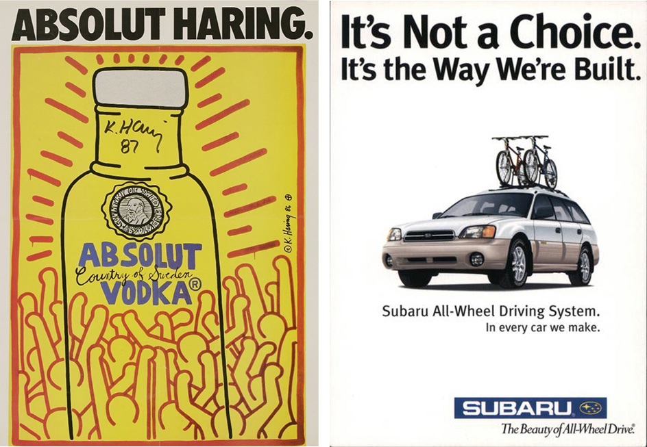
The ‘80s and ‘90s saw subtle 2SLGBTQ+ representation in print advertising, through Absolut Vodka’s ad featuring artwork by gay artist Keith Haring, or Subaru’s series of ads featuring their “it’s not a choice, it’s the way we’re built” tagline. But nods to 2SLGBTQ+ culture, which were referred to as “gay window shopping,” in mainstream media were just that—nods. There was no direct mention of queer culture in the ads, and you could only pick up on the references if you were in the know. Yes, it was progress, having the community be recognized, albeit subtly, but it still wasn’t enough. 

It wasn’t until 1994 that a major brand took what, at the time, was seen as a risky leap.

IKEA’s “Dining Room” spot was the first television commercial in America to feature an openly gay couple. There were no nods. There was no room for ambiguity. It was two men shopping for a dining room table, openly discussing their romantic relationship on camera and how buying a table with a leaf in it is a major commitment for them (and they’re right. A leaf? That’s practically marriage!). 

Though this all may seem insignificant to us today considering how normal it is to see same-sex couples on our screens, in 1994—before shows like Will & Grace or Sex and the City had aired—seeing a gay couple on television who weren’t being used as a punchline was groundbreaking. The ad received backlash from Christian community groups, but IKEA didn’t back down, refusing to pull the ad despite threats of boycott. It was one of the first times a major brand took a stand to support the 2SLGBTQ+ community, opening the floodgate for other brands to follow in their footsteps. 

2SLGBTQ+ representation in today’s media and why representation matters year round — not just during Pride Month

It’s important to remember that 1994 wasn’t long ago, though the quality of video may make us feel like it was centuries in the past. In less than 30 years, we’ve seen an influx of representation to the point where seeing a same-sex couple in an ad no longer makes us say “Oh, wow! That’s rare!” In fact, in a study conducted by DISQO and Do the WeRQ, only less than 7% of people couldn’t recall seeing an advertisement featuring the 2SLGBTQ+ community.

Now, it’s not unusual to see two women sharing a meal with their kids at a new restaurant, or two men holding hands as they walk down the street in the latest footwear. But while 2SLGBTQ+ representation is indeed becoming more and more common, that doesn’t mean there isn’t still work to be done. 

Many ads featuring queer couples still fall into a “safe” category of advertising, which is to say two white gay men. It’s considered the most acceptable version of queer representation as it’s the one people are most used to seeing, but the 2SLGBTQ+ community is so widespread and diverse, to not highlight all the different facets of people who fall under the umbrella begins to feel exclusionary in itself.

The struggle, however, is how do you say you want better representation without discounting what already exists? Of course we want queer representation in advertising whenever possible. At this rate, it should be as second-natured as breathing. But it needs to be authentic. Being pandered to or used as a gimmick is not the same as being represented and seen. Harmful stereotypes in mainstream media serve as a way for companies to say “See? We’ve ticked the box!” 

But the queer community is not just a box to be ticked in the month of June. We are a unique, diverse group of people who deserve to see ourselves in advertising just like any other person. Why should we only get to see ourselves in the media one month out of the year? Why should we only be thought of when it serves to make companies more money? When will seeing a queer couple in advertising stop being a talking point and start being the same as anyone else?

Representation is a 365-day commitment. 

By the numbers

  • 1 million Canadians identify as being part of the 2SLGBTQ+ community (source)
  • $3.7 trillion is a conservative estimate of the global 2SLGBTQ+ buying power (source)
  • 72% of consumers believe brands have an influence on 2SLGBTQ+ rights (source)
  • 85% of consumers consider a brand’s social and political activities when making purchases (source)
  • 52% of consumers believe 2SLGBTQ+ ads are authentic (source)
  • 70% of Gen Zers believe it’s important for content to be made inclusively (source)

Moving forward 

Authentic, deliberate, and compassionate representation is important, as queer people of all generations look to see themselves in the media they consume. The progress we’ve made is substantial, but there’s still so much more road to travel. 

So how do we take the first step? In an interview with The Wall Street Journal, Sarah Kate Ellis, president and chief executive of GLAAD, spoke about the importance of bringing 2SLGBTQ+ experts to the table early when it comes to marketing and advertising.

“Way too often we are called in to cosign an idea that’s fully baked only to flag areas of harm or stereotyping,” she said.

Engage with the community, encourage coworkers who are part of the queer community to share their ideas, and most importantly, let those same co-workers know they’re in a place without judgement. 

The good news is, things are changing for the better. And the best is surely yet to come. 

Categories

design

Brand Identity Design: 5 Tips for Maximum Brand Impact

So, you’re looking to strengthen your brand identity. One question: do you have a clear understanding of what your brand identity entails? It’s more than a logo and a slogan (though these are crucial elements). Your brand identity also encompasses elements like personality and values. This is a lot to iron out on the fly – which is why an intentional brand identity strategy can help you clarify how to present your brand to the world.

Establishing a distinct and memorable brand from the get-go helps you stick in your audiences’ minds. It helps you stand apart in a sea of competitors, and can inspire customer trust and loyalty. You’ll build a community of dedicated followers who remember, appreciate, and seek out your offerings first.

So, how do you do it? Let’s start by focusing on your brand’s visual identity – your one chance to make a first impression.

What’s a Visual Brand Identity?

Consider your brand’s visual identity the totality of the visual elements you put on display. Everything that contributes to the “feel” you want people to experience plays a part, from logos and colours to imagery, typography, and iconography. Taking time to think about how these elements work together will help you create the impact you want.

It’s also important to consider how you’ll convey these attributes to your various audiences. Think of brands that stick out to you. No matter the industry they’re in or the product or services they provide, they all have something in common – impact on customer behavior. If you also want to have that kind of impact, you need to build a brand identity rooted in your target audience. Intentionally design your brand identity to connect with your audience emotionally and stick with them.

5 Tips for Designing Your Brand Identity for Maximum Brand Impact

Now that you’ve got a handle on the breadth of what your visual brand identity constitutes, let’s explore how you can maximize its impact. Implementing one or more of these tips can help keep your brand fresh in the minds of your audiences, so don’t hold back! Explore how you can represent your personality and increase your recognition with a strong brand presence.

1. Create a Purposeful Colour Palette

Did you know that colours affect our behaviour? From the bright caution of poisonous insects, to the excitement that candy stripes bring, or the monochromatic zen of a spa, colour schemes directly influence our emotions. 

When it comes to your brand, you want your audiences to come away with a distinct (positive) impression. An appropriate colour scheme can help articulate your identity. Decide what colours speak to your story, then design your logo and graphic motifs around this palette.

Along with evoking the feel of your brand identity, you also want to consider consistency. Perhaps you’re going for muted, earthy tones – an intrusive bright lemon might throw the whole thing into chaos. Or conversely: if you’re looking for a sharp, crisp, warm colour scheme, a dour or heavy purple might drag the whole arrangement into a muddy mess.

Setting – and sticking to – a distinct and harmonious colour palette will ensure that every visual you present to your audiences represents your brand cohesively. Intentionally establishing this ahead of time will help define clear parameters on your brand identity design journey.

2. Find the Right Typography

Just like with your colour scheme, the typography you choose will tell people a lot about your brand. With so many templates available, it can be easy to choose whatever font looks appealing at the moment. But in the hurry to churn out content, typographic inconsistency can hurt your brand.

Typography sets the tone for the content, before readers even dive in. Make sure it’s the right tone! For example, if you’re trying to convey a rustic, “salt of the earth” image, consider typography that looks hand drawn. Older, established serif fonts like Trajan can send an institutional authority; if your brand brings more of the young, hip disruptor energy, perhaps consider something bold and blocky instead.

Whatever you’re trying to convey, choose typography that aligns with your brand identity – and use it consistently. This way, those who see your brand can tell it’s you, sometimes before they even see your logo.

3. Develop Visual Consistency to Establish Brand Identity

Consistency has quickly become a theme; we’ve emphasized it because it’s often overlooked in the brand identity design process. 

From brand development to social media campaigns, visual consistency is essential to maximizing impact. With so many channels of communication, it can be easy to lose the thread – which is why consistency must remain an intentional practice to keep your messaging clear.

Imagine visiting the site for your favorite clothing line. You’ve always engaged with them on social media, where they feature bold primary colours and dynamic typographic choices. But their website is an assemblage of muted neutrals and a delicate cursive font. You’d think you have the wrong website!

To keep consistent, consider standardizing the following across your platforms:

  • Graphics sizes
  • Templates
  • Overall brand cohesiveness
  • Updating templates – this is especially important after a rebrand or acquisition

4. Integrate Accessibility Into Your Brand Design

Get your brand in front of the people that need to experience it! You can have a wider reach by authentically weaving accessibility into your brand identity design. This lets the widest possible range of people experience your brand. Better yet: it’s just plain respectful to be as inclusive as possible.

For example, consider adding alt text for photos, as customers who are visually impaired might miss out on your brand’s graphic content without it. Ensure that your font is screen reader–friendly or has captions for those who are hearing impaired. Add a decent amount of contrast to your content so that text stands out clearly. (Tip: run your colour combinations through an accessibility checker before publishing.)

5. Consider Your Brand Identity in Video

So we’ve covered brand identity for static applications. But don’t forget that your brand needs to work in motion! Whether it’s on social media, websites, or connected TV, video is everywhere these days, so as you build your visual brand, consider how it’ll move and animate. Is there an interesting way to animate your logo? What about kinetic typography? Is your primary typeface conducive to motion? Testing and exploring these potential avenues is vital as you proceed along your design journey.

Get Started on Your Brand Identity Design

Developing a coherent, consistent brand identity is a must. It’s difficult to connect with your target audience without it. But with so many elements to consider, oftentimes getting started can prove the hardest step. That’s why it’s important to work with branding experts who understand your organization and the experience you want to create.

Don’t go it alone: let Alphabet® help. We’ll help you uncover the truth of your brand – then help you integrate, execute, and live that truth throughout your entire organization. 

Are you ready to build a brand that’s true to your business? Reach out to Alphabet® today and let’s get started!

Categories

industry

Branding Questionnaire: How to Optimize Your Research

Setting your brand apart in a saturated market is no easy feat. However, there’s an invaluable tool that can help you achieve this: a branding questionnaire.

A branding questionnaire is a set of questions designed to gather information from various stakeholders about an organization. It helps define your brand positioning, values, voice, and personality – and ultimately your brand strategy. When you understand how different audiences (both internal and external) perceive your brand, you can develop a brand message and marketing strategy that resonate with your identified target market.

Let’s take an in-depth look at how to develop a branding questionnaire and then use it to shape your brand story and stand out from the crowd.

Determining the Stakeholders

Various groups of people are essential to making your brand a success. Depending on your organization, these stakeholders might include employees, partners, donors, vendors, members, and customers.

Identifying and understanding their needs and preferences is key to developing powerful, unique, and attractive branding. After all, these stakeholders can offer valuable insights to help guide and strengthen your messaging.

A branding questionnaire directed toward stakeholders can uncover their perception of your brand, products, services, or solutions. You can then clarify strengths and weaknesses and identify areas for improvement. However, overlooking any group of stakeholders can lead to a missed opportunity. For instance, not considering investors could lead to lost funding, which makes serving customers difficult. Similarly, leaving out employees can cause high employee turnover and impede business efficiency.

When formulating your branding questionnaire, you want to encourage stakeholders to express honest opinions about various brand aspects. Let’s look at ways to achieve this.

Branding Questionnaire: Questions, Examples, and Tips

You must ask the right questions to get the most out of your branding questionnaire. By including relevant, open-ended questions about brand perception, you can see what stakeholders think of your brand. Use these tips to develop a branding questionnaire that will provide the insights you need:

1. Design for Engagement

Your survey design is integral to keeping users engaged and encouraging them to complete the entire questionnaire. Maintain respondents’ interest with interactive graphics, conversational questioning, and inventive question formats. Use a survey platform that provides a pre-built, user-friendly, and engaging survey design to make this easier.

Remember, participants don’t have all day to dedicate to your survey. So, keep it brief and only include questions essential to your research.

2. Identify Your Target Audience

A branding questionnaire is only useful when directed at the right audience. In most cases, you want to get feedback from the specific group most likely to be interested in your product, service, or solution. Distributing your survey to the relevant audience will give you a more accurate indication of how you compare to competitors.

Use a different survey for employees, partners, members, etc. 

3. Offer Optional Anonymity

When you allow survey participants to remain anonymous, they’re more willing to complete the survey and provide honest feedback. Don’t be afraid to ask tough questions – it’s the only way to get real results and make improvements, even if you don’t like the answers.

4. Combine Aided and Unaided Questions

Unaided questions are open-ended. For instance, if you’re a tourism brand, an unaided brand awareness question could be, “What Ontario cities are great to visit in the summer?” Unaided brand awareness questions can see if you rank top-of-mind among prospective customers without prompting them.

Aided questions mention your brand by name. For example, you can provide a list of brands (including yours) and ask, “Which of these brands are you aware of?” You can also include brand logos or images instead of names.

Results might indicate that 90% of your target audience is familiar with a competitor’s brand while 75% is familiar with yours. You can then benchmark brand recognition.

Tip: 

It’s always better to start your branding questionnaire with unaided questions to prevent respondents from taking a cue.

5. Dig Deeper Into Brand Perception

Follow up with character questions to gain feedback about what your audiences associate with your brand and what they think about it. For instance, you might include a question such as, “What words would you use to describe [brand name]?”

6. Be Concise

When formulating your questions, don’t leave any room for interpretation. Instead, be clear about what you’re asking and choose simple language anyone can understand. Avoid industry jargon, technical terms, and complicated sentence structures.

How to Make Use of Your Brand Questionnaire Findings

Your branding questionnaire will reveal the most common threads and perceptions from various stakeholder surveys. Ideally, you turn this into a key findings report to clearly see your strengths, weaknesses, opportunities, and challenges. These insights enable you to make informed decisions about your branding and marketing strategies. 

Let’s say your survey revealed lower brand awareness than anticipated. This shows you need to focus on brand awareness as a primary goal before acquisition and retention.

Use insights from every stakeholder session to develop measurable goals with a time frame linked to outcomes. For instance, you might want to improve your brand messaging, refine your target audience, or create new products, services, or solutions to better suit your audiences’ needs. It can also include enhancing internal communications, cultivating a positive work environment, and facilitating ongoing employee education.

Communicate the results and your strategy going forward to the relevant stakeholders. Where appropriate, involve them in decision-making to ensure their buy-in and support for the brand’s direction. Keeping relevant groups informed about findings and changes ensures everyone works toward the same goal and builds a positive sentiment. It also confirms to stakeholders that you’re proactively and continuously improving your brand. Ensure the defined strategy addresses the identified problems and determines specific, actionable steps to solve them.

Boost Your Brand Impact With Alphabet® Creative

Your brand is more than your company name and logo. It’s the entirety of your organization from your culture, people, and processes to your vision, voice, influence, and reputation. It’s also how your stakeholders feel about you – which is why it’s vital that you ask them. 

No matter the size of your business, you can’t grow if you don’t know your strengths and weaknesses. Likewise, you can’t strategize to better communicate and add value if you don’t know what draws your audience to your brand.

We’re here to help. At Alphabet®, we approach every brand project with a deep research and discovery phase. It’s how we uncover your true and authentic brand story – then align your brand strategy with your business strategy to solve real problems, impact change, and get the results you want.

Ready to harness your brand’s potential? Contact our branding experts today.

Categories

industry

How to Create A Brand Messaging Framework

Building a strong and unique is an intentional process. Whether you are launching an entirely new business or doing a brand refresh, a comprehensive brand messaging framework can help your team communicate with clarity and purpose.

In a nutshell, your brand messaging framework is a documented brand strategy for what you’ll communicate to various stakeholders. It defines your central message and helps you create a consistent and cohesive narrative about your unique selling points across multiple communication channels. Establishing this framework is key to helping your business build trust, credibility, and relevance with clients; it also helps differentiate you from competitors.

Here’s a step-by-step guide to creating an effective brand messaging framework, paving your way to successful brand communications.

1. Engage With Your Customers and Other Audience Groups

To create impactful brand messaging, get to know your target audience segments inside out. Research their needs, likes, and values to develop messaging that resonates with them. By addressing their pain points and tapping into the emotional and rational drivers behind their motivations, you can truly connect, foster loyalty, and boost your brand’s success.

When determining the best brand messaging framework strategy to appeal to your target audiences, analyze the following attributes:

  • Demographics, such as age, gender, socioeconomic status, income, education, marital status, and profession
  • Psychographics: characteristics like attitudes, aspirations, lifestyle choices, and other psychological criteria, including emotional decision drivers.
  • Interests and hobbies
  • Consumer behaviour, including their preferred social media networks and payment preferences

2. Conduct a Competitor Analysis

The first step in examining how you stand amongst your competitors is to investigate their strategies. You need to identify what makes your brand pop; a competitor analysis helps you clarify and strengthen your value proposition.

Measuring yourself against competitors helps you understand how they position themselves. Then, you can capitalize on that knowledge to avoid getting drowned in a sea of sameness and stand out to your customers and other audience segments. You can strategically take advantage of vulnerabilities in competing products, services, and solutions and sharpen your unique brand messaging framework accordingly.

Identify Your Competitors

You probably have an idea of who your direct competitors are—but if you’re unsure, perform an online search for your service or offering. Check whether the listed websites market to the same audience and whether their offering solves the same problems.

Choose competitors who fall into a similar price, quality, or level-of-service category as you, depending on what you offer, as well as market leaders. Including market leaders in your analysis gives you something to work towards.

Analyze the Customer Journey

Take a journey through your competitors’ websites as if you were an ideal customer or visitor. Identify aspects of the experience with their product, solution, or service that you like. Consider if this can be uniquely adapted to fill gaps in your offering.

Compare your pricing strategy, if applicable, and possible reasons for pricing gaps. Ask yourself: are you more affordable or expensive than your competitors? Why is that? Does that align with how you want your clients to perceive you (e.g. premium versus more accessible)? Understanding how and why your offering reflects the value for its price will help inform your messaging framework.

Review Competitors’ Marketing Strategies

Review the channels and messaging your competitors use in their marketing strategies. Are their channels performing better than yours? What you are doing differently from them? What are the continuities?

3. Develop a Unique Brand Voice

Just like a person’s personality makes them unique, so does a business’s personality.  The next step in building your messaging framework is to develop a brand voice that not only sets you apart, but stays true to your organizational purpose and values – those foundational elements that inform every step of your brand development. An appealing and unique brand voice can improve relatability, recognition, and customer loyalty.

The key to developing your brand voice is first defining your brand personality. Is it playful, fun, serious, informative, or irreverent? One thing we’ve found that helps with this process is pinpointing a brand archetype, which helps humanize your brand. Is your brand a caregiver? An explorer? A creator?

Not entirely sure yet? Figuring out what your brand is not can also help you pinpoint it. During a brainstorming session, your team may determine that your brand is not too serious, pretentious, formal, or aloof. On the flip side, this might mean your brand is: friendly, humble, informal, and down-to-earth.

The ultimate goal, here, is for customers to easily recognize your brand no matter the medium—mobile, email, social media, or billboards. While it won’t happen overnight, having a consistent tone of voice is key. It’s no longer just about the visual aspects of your brand, as important as they are; what you say and how you say it are equally important in boosting brand recognition.

4. Build Your Brand Messaging Framework

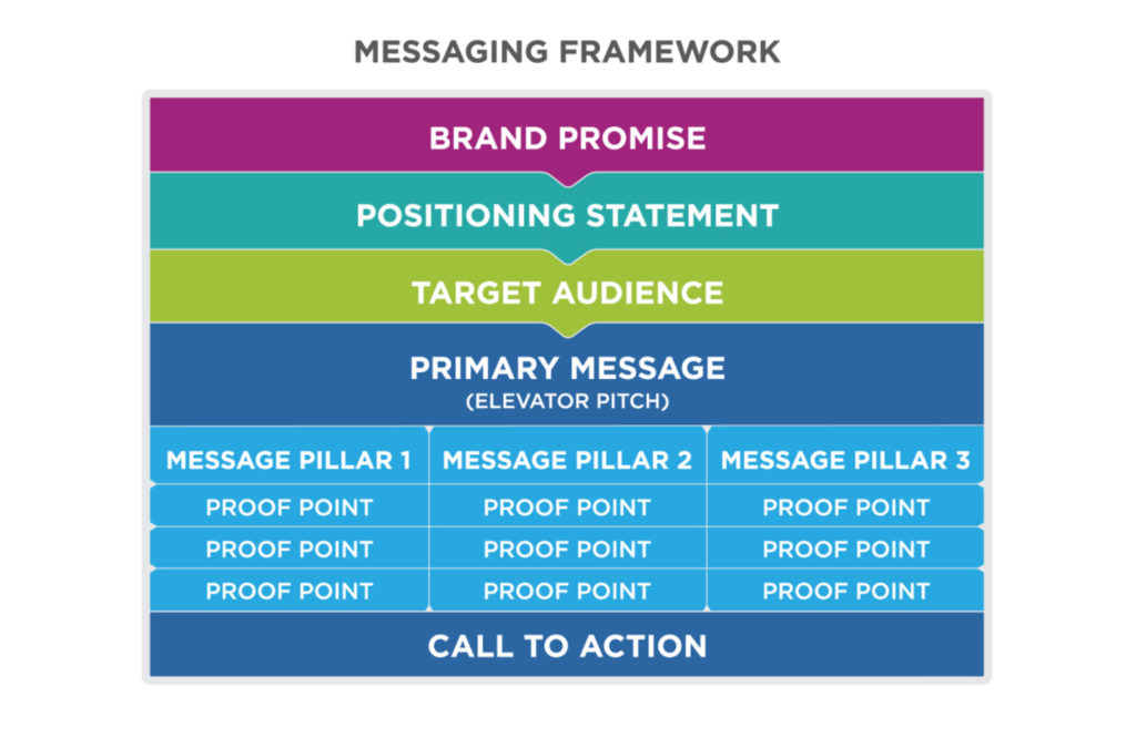
Once you’ve done your audience and competitor research, and defined your brand voice, you can start to craft and tailor your messaging with pinpoint accuracy. Employing a message house framework can help you develop consistent on-point messages.

A message house framework comprises, at minimum, three levels: a key message, supporting messages, and proof points. These work together to clearly communicate your value. Depending on what service or solution you offer, it may have several supporting messages and proof points tailored to different audience segments.

To develop a message house, identify the primary message you want to communicate. It can be for your brand as a whole or a specific campaign for your flagship services or new offerings; just keep it concise, memorable, and easy to understand – and focused on your audience and how it benefits them. Then develop supporting value statements, or pillar messages, that unpack and reinforce your main message.

With your main claim and something to back it up in place, all you need is proof to ensure a convincing message. Identify proof points that validate and substantiate your messages using evidence and facts.

Your framework might look something like this:

5. Evaluate and Optimize Your Brand Messaging

Changing consumer preferences and market competition mean even the most thorough communications plans may require periodic updates. Your brand messaging framework is not a set-it-and-forget-it task. While the initial draft will require the most work, failing to evaluate your strategy regularly and make adjustments as necessary will drive your brand into irrelevance quickly.

Give Your Brand Messaging the Attention It Deserves

A strong brand message sticks with consumers and other audience groups, and differentiates you from competitors. Navigating the complexities of brand development, design, and establishing a messaging framework can be challenging while you’re trying to run a business; however, not giving these aspects the attention they deserve can impact your business identity negatively in the long run.

Investing in brand development is undoubtedly one of the most important things you can do for your business’ long-term success. That’s where Alphabet® comes in. We’ll work with you to develop and execute a brand messaging framework that reflects your business personality, sets you apart, and resonates with your audiences.

Contact our brand experts today and bring your brand to life.

Categories

industry

Building a Branding Campaign: What, How, Why & Where

No matter your business niche, the playing field is likely chock-full of competition. That’s why it’s more important than ever to develop a strong branding campaign within your marketing plan.

According to data from the Revenue Marketing Alliance, most companies think of branding as a way to differentiate their business from competitors. While this is true, your branding can be so much more. By running a thoughtful campaign, you make your brand work for you, building relationships with consumers and growing your business.

At Alphabet Creative, we understand the importance of holistic branding—and how to use your brand identity to bolster business growth. A branding campaign doesn’t just advertise your brand and its promise; it nurtures a relationship between your target audience and your brand persona that generates a loyal consumer base. But how do you do it? Here, we go over the what, how, why, and where of a branding campaign – so you know where to start.

What is a Branding Campaign?

A brand campaign leverages your brand promise to build a positive association with your brand. This is unlike a product- or service-specific campaign, which aims to entice customers into making a purchase. Instead, branding campaigns mean playing the long game of building awareness, recognition, and loyalty. When executed well, your brand becomes synonymous with your services, experiences, or solutions, and your consumers feel like they have a relationship with you.

A successful branding campaign fosters a customer base that loves your brand. With so many options on the market, consumers turn to the brands that they connect with and trust. Effective brand marketing is key to building this relationship and influencing consumer purchases and behaviour.

For example, if you build a brand that stands for humanitarian rights, it doesn’t matter if you only sell socks. People will flock to your company because they resonate with your mission and share values with your brand. Your products and services merely serve as proof of your value. Brand marketing is all about loyalty in the brand-consumer relationship.

Key Steps to Building an Effective Branding Campaign

So you get why brand marketing is important—but if you only have a logo and a dream, you may not know where to start. Launching a brand campaign is key to establishing your company in your niche, building customer loyalty, and, ultimately, driving conversions. To do this, you’ll need to dedicate careful effort to fleshing out the details of your campaign. It all starts with effective and creative brainstorming.

Once the ideas are flowing, follow these six steps to building your brand marketing campaign.

1. Establish Your Goals & Vision

The first step to creating an effective branding campaign is to establish your goals. Without a clear vision, a piecemeal branding campaign likely won’t have the desired effect. While most marketing goals centre around generating leads, increasing conversions, and increasing brand awareness, you’ll need more than these vague marketing platitudes.

Successful branding campaigns call for specific goals. Take inspiration from the SMART goal philosophy: each goal should be Specific, Measurable, Achievable, Relevant, and Time-Sensitive.

For example, instead of saying your goal is to “increase engagement,” take it a step further. Changing it to “increase engagement rate on Instagram by 40% in Q3” has more specificity and intention. Now you know exactly where to target your efforts and what success will look like.

2. Identify Your Target Audience

Developing your branding campaign means knowing who you’re talking to—you must identify your target audience from the start. This isn’t just blind guessing; find your target audience by sifting through existing data on your consumers. Then create in-depth buyer personas. These will help you understand who is converting to your brand—and why they are choosing you over your competition.

Well-developed buyer personas help you walk in the shoes of your consumers. For example, if you want to attract leads who are 35-49, value job security, and have moderate-to-high incomes, then you probably won’t use the newest Gen Z slang in your marketing copy. Instead, you’ll adopt a voice that caters to their desire to make informed decisions and investments that support work-life balance.

3. Choose Your Designated Platforms & Channels

With your goals outlined and your target audience defined, the next step to developing a brand marketing campaign is deciding your platforms and channels. In most cases, you will run simultaneous campaigns in multiple spaces. Each requires slight adjustments to message and imaging.

Your platforms are the spaces where a consumer engages with a brand’s digital presence. This includes your website, social media platforms, mobile apps, and so on. Channels are the means that you communicate directly with your audience—think emails, ads, chats, and messaging apps. Most platforms have a respective communication channel (direct messaging on Instagram, or a chat box on your website).

Your target audience will impact which platforms and channels you choose. Discover where your prospective consumers spend their digital time and dedicate your brand campaign to those spaces.

4. Determine KPIs

Polishing your current marketing plan is a more efficient use of resources than scrapping it and starting from scratch. But if something didn’t work, how do you know what to change?

Reflecting on your key performance indicators – or KPIs – and other important metrics will help you see what’s working in your branding campaign and what parts didn’t pan out. Use specific metrics to address issues and make changes; track brand engagement, brand awareness, conversions, and repeat customers, along with asking for feedback from customers. With a bit of time and tweaking, you will better meet customer needs and get better ROI for your branding campaign.

5. Set Campaign Timeline & Budget

Your branding campaign is really getting somewhere now—but to put it into action, it needs a timeline and budget. This means breaking down your overall goals into smaller points and defining your key results.

Your campaign’s timeline likely won’t be linear. If your goal is a 40% increase in engagement, don’t expect a steady increase of 5% each week. Instead, give your team time to research and prepare materials, to implement and tweak your campaign, and so on. It’s helpful to define your workflow in advance, so you can gauge progress each week.

A branding campaign takes more than just time and expertise. It will likely require cold hard cash. Ads, employee time, and software subscriptions add up. In the planning phase, form a clear estimate of both your timeline and budget so you can hit the ground running.

6. Create Campaign Promo Materials

Now that you know the what, when, how, and why of your branding campaign, it’s time for lift-off. That means creating the quality content of your brand and sending it out into the ether.

From the imaging and visuals to the tone of the copy, everything must be dialled in to reflect your brand identity and speak to your prospective consumers. Be creative but consistent—you want to build on your differentiators without confusing your audience. Everything should feel aligned, from ads to packaging to customer service.

Intimidated? Alphabet Creative Can Guide Your Branding Campaign

Running a branding campaign as part of your marketing strategy builds customer loyalty. An attractive brand that speaks directly to your target audience will help you generate more leads; but it takes nuance, skill, and experience to develop a winning branding campaign.

Our years of expertise enable us to guide our clients through integrating brand identity flawlessly into marketing campaigns. Together, we’ll uncover your brand story and help you build and execute campaigns that truly celebrate the soul of your company.Are you ready to level up your branding game? Reach out today!

Categories

design

Five Famous Logos (and Why They Work)

Your logo is the most central element of your brand design. In fact, for many customers, logos represent the proverbial “face” of the company, serving as a key driver of brand recognition. No pressure, right? Well, don’t fret – instead, take a look at some of the most famous logos as a springboard for your own design process.

Noting the commonalities between impactful brand logo designs can help you spot some repeatable formulaic elements. For example, factors like simplicity, memorability, notability, and distinctness all contribute to a standout design.

Effective design communicates brand messaging through presentational elements such as colour schemes, imagery, and typography. Let’s take a closer look at five of the most famous brand logos and see what makes them such hits. These icons offer valuable lessons on how to actively and deliberately use design elements to convey a clear message.

1. IKEA

The IKEA logo exemplifies the concept of simplicity in design while maintaining a strong visual impact. The logo has largely remained the same since 1982, with just small updates to the block font’s spacing and size in 2019 (along with a few other subtle refinements).

The longevity of IKEA’s logo has made the design highly identifiable to customers. That bold blue-and-yellow layout also pays homage to the brand’s Swedish origins, working the brand’s story right into the visuals. Consider too: the design’s simplicity works on a practical level, as it’s easy to reproduce at any size – perfect for a variety of different branding campaigns.

The sturdy build of the typography suggests structural reliability; meanwhile, the simplicity of the layout nods to the brand’s accessible and straightforward approach to furniture. Ultimately, IKEA tops the list of famous logos because of its balance of easy recognizability, simplicity, and clear alignment with brand strategy.

2. McDonald’s

The iconic Golden Arches are known around the globe as a symbol of convenience, consistent quality, affordability, and Big Macs. Many customers find the famous logo comforting, as the fast food chain has emphasized convenience and reliability over the decades. But from a design perspective, it’s the carefully selected colour choice that gives the McDonald’s logo its magic.

McDonald’s chose red and yellow because of research indicating that the colours stimulate hunger – making them ideal for a fast-food chain. Colours have a significant impact on human behaviour, meaning the hues you choose for your logo will engender certain feelings in customers. When considering different schemes, ask yourself what emotions or perceptions you want people to associate with your brand.

3. Shell

Shell’s logo design goes all the way back to 1904, when founder Marcus Samuel embraced the natural symbology of hidden treasure. The visual equates the preciousness of a hidden pearl with that of the company’s oil. Furthermore, the logo suggests company consciousness regarding environmental concerns, positioning Shell as a responsible industry leader. The symbol also carries positive connotations of energy and innovation – both critical elements of the corporation’s operational function and mission.

This historic example shows the connotations attached to famous logos can make a difference in people’s perceptions of a brand’s development. Shell’s logo also exemplifies the power of consistency. While small details and colours have changed, the central shell imagery has remained the same for well over a hundred years.

4. Red Cross

The Red Cross is synonymous with humanitarian aid – and the logo reflects this association. The simple yet impactful red cross on a white background was first adopted in Geneva over 150 years ago to represent medical personnel on the battlefield.

An emblem of neutrality, trust, reliability, and care, the logo serves to protect providers and patients by declaring humanitarian values and an uninvolved stance in conflict. Of all these five famous logos, the symbol of the Red Cross best exemplifies the power of association that recognizable imagery possesses.

5. Starbucks

Starbucks’ positioning is a great example of luxury brand development, as the company carefully curated an association with quality that has transformed its logo into a status symbol. This generates free marketing from customers as people proudly display cups and tumblers embossed with the logo at work, walking down the street, and in online posts.

The Starbucks logo also benefits from its distinctive design. The company’s long-haired mermaid is more visually complex than the other logos on this list; sometimes, bending the design rules a little works in your favour. This earthy, more antiquated design works with the brand’s messaging, as the company conveys an established and reputable perch in a community-centred industry.

Developing Famous Logos

These five famous logos exemplify the fact that developing a visual identity is a critical component of your brand positioning. The right logo can revitalize your public image and engage new customers—but the wrong imagery can damage your marketing efforts with inconsistent messaging. Ultimately, the best way to ensure the success of your logo design is to work with experts to develop unique imagery for your brand.

Alphabet® has a proven track record of successful brand development and design projects, with clients ranging from a full spectrum of industries. We take a calculated approach to building your brand, combining our years of experience with a careful eye on market trends.

Are you ready to bring out the best of your brand’s identity – and connect with new audiences in the process? Reach out to Alphabet® today—together, we’ll help your brand tell a fresh story.

Categories

industry

Alphabet® Wins Two Summit Creative Awards for Work with Tourism Kingston

We’re proud to announce that we’ve won not one but two 2022 Summit Creative Awards for our recent work with Tourism Kingston. The Summit Creative Awards recognize outstanding advertising and marketing communications internationally among small and medium-sized agencies.

“I can’t wait until you get here”

A gold winner in the Travel/Tourism/Nature Video category, the “I can’t wait until you get here” brand anthem video for Tourism Kingston came together over the course of two years. Partnering with Kingston-based Untold Storytelling, filming began in 2019 and wrapped in 2021, capturing footage from all four seasons.

The video tells the story of two people reuniting in a place that’s close to their hearts, a vibrant, charming city where people meet, connect, and create lasting memories: Kingston, Ontario.

The video was publicly launched for the first time in late 2021 and will continue to be at the core of Tourism Kingston’s marketing presence for years to come.

“Closer”

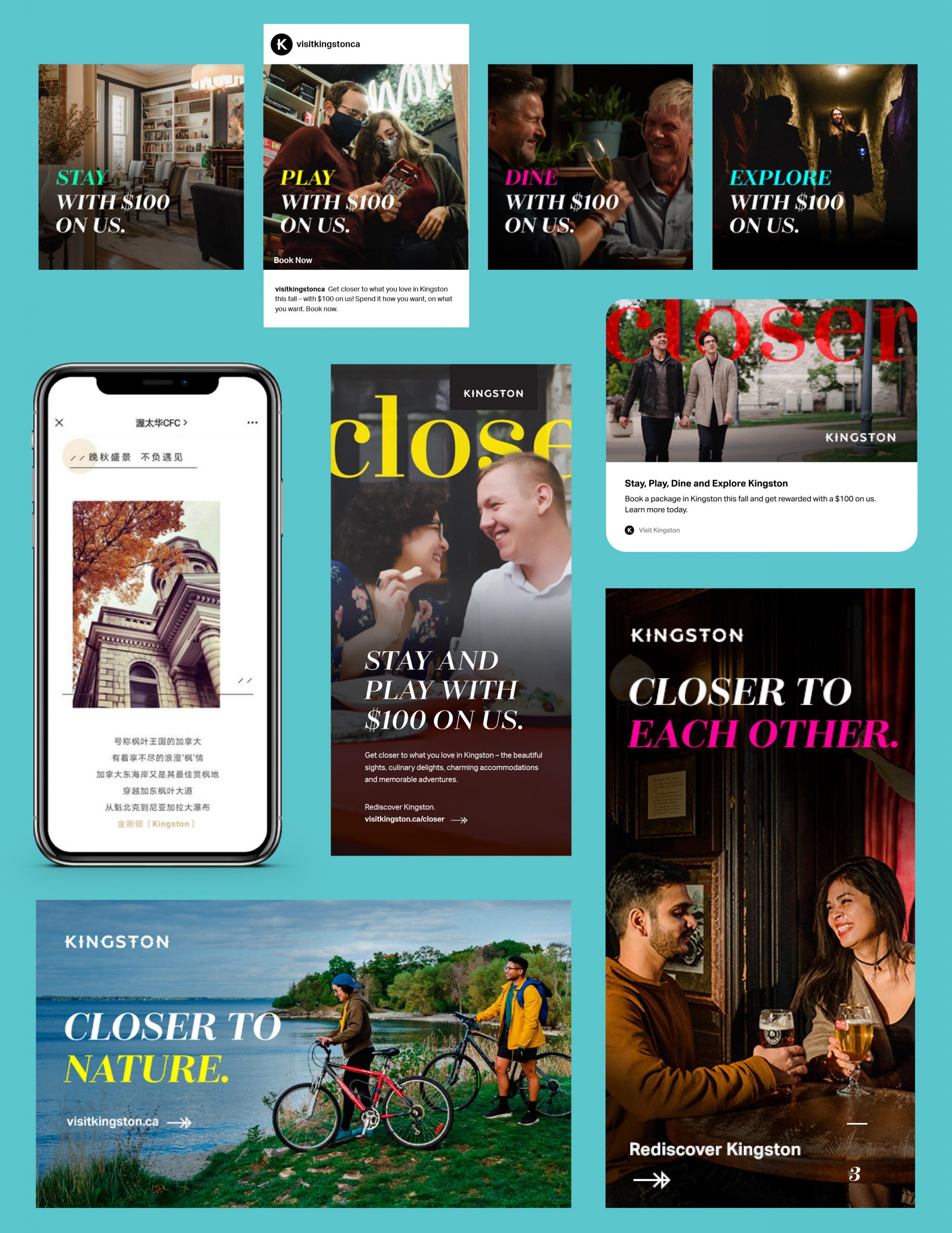
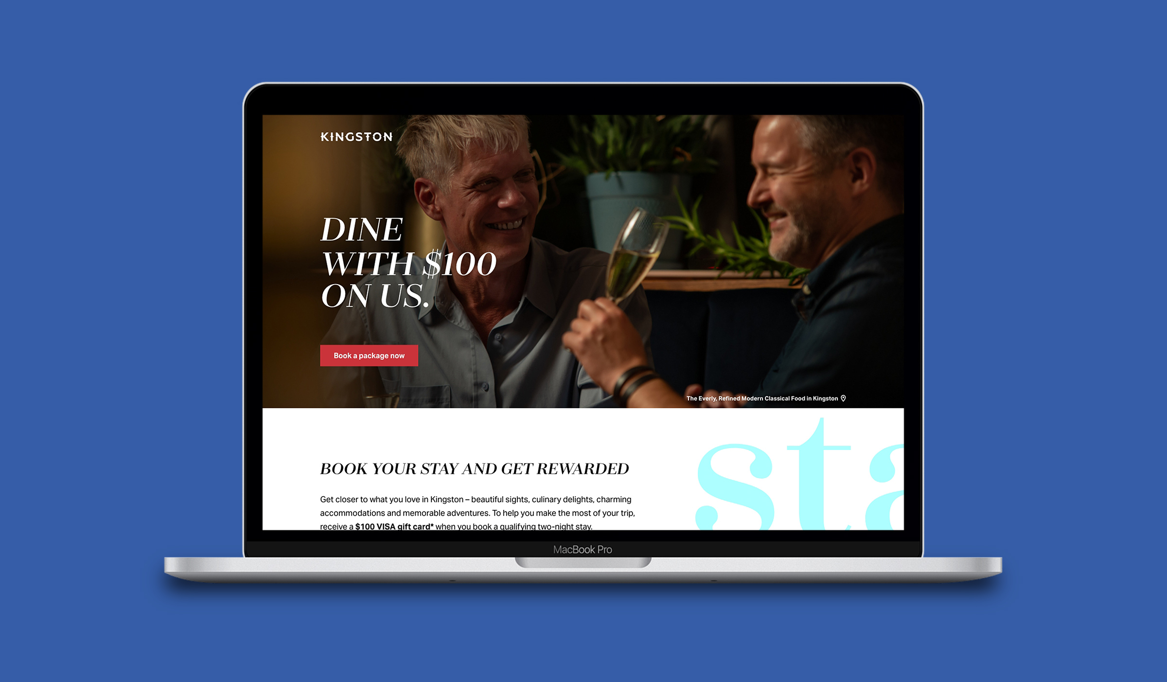
Winning a bronze trophy in the Integrated Campaign – Consumer category, the “Closer” campaign for Tourism Kingston launched in 2021 as leisure travel began to rebound from COVID-19.

We knew that people were tired of being kept apart, so we leaned into this truth but also people’s desire to reconnect to the experiences they love most, like going out for dinner, strolling through a gallery, or perusing a downtown boutique – all of which you can do in Kingston.

At the same time, there was a burgeoning movement toward supporting local, with consumers poised to spend their dollars at local restaurants, shops, and attractions. We leveraged this insight and communicated Kingston’s close proximity to its target markets of Ottawa, Toronto and Montreal while tugging at the heart strings of our audience.

Want to learn more about our work with Tourism Kingston? Check out our case study here.