Bank of Canada Museum: Cooler than you think

Strategy

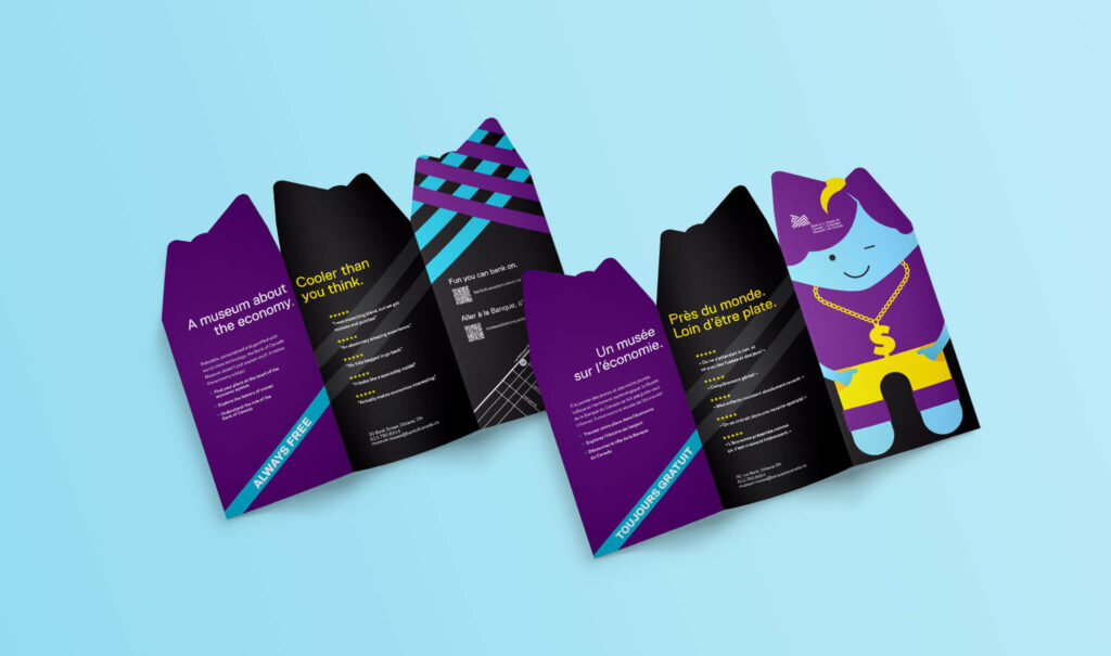
Our job was to help shift the perception. To break the stereotype. To take what some considered a dry topic and show it under a different, more engaging light. To do that, we mined real Google reviews from visitors, revealing a consistent theme. People didn’t expect the museum to be so fun and enjoyable, especially for kids. But it was. 

This insight became the cornerstone of the campaign. From there, we built a creative platform that played with contrast. We wanted to show both sides of the experience—historic and high-tech—and position the museum as immersive, fun, and yes, cooler than you think.

Execution

We brought the concept to life through a branded video and custom rack card design. Along with research and creative ideation, the scope of work included:

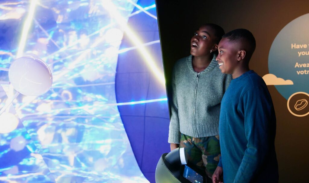
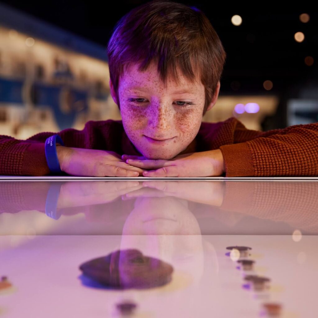
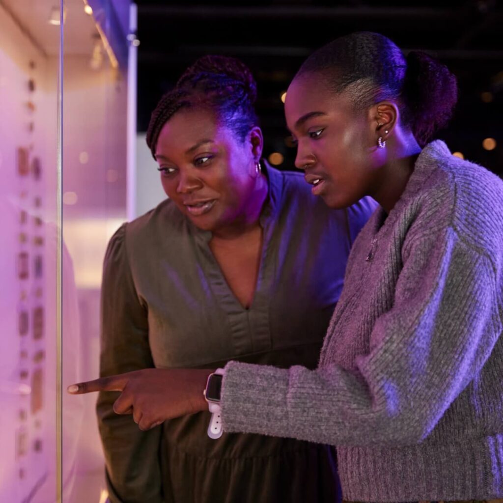
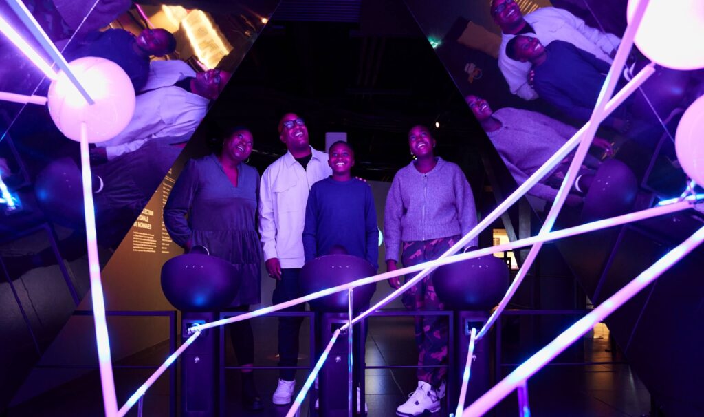
  • Video production: Shot on-site and guided by our creative direction, the video highlighted the interactive elements of the museum, using stylized lighting and pacing to match the unexpected tone.
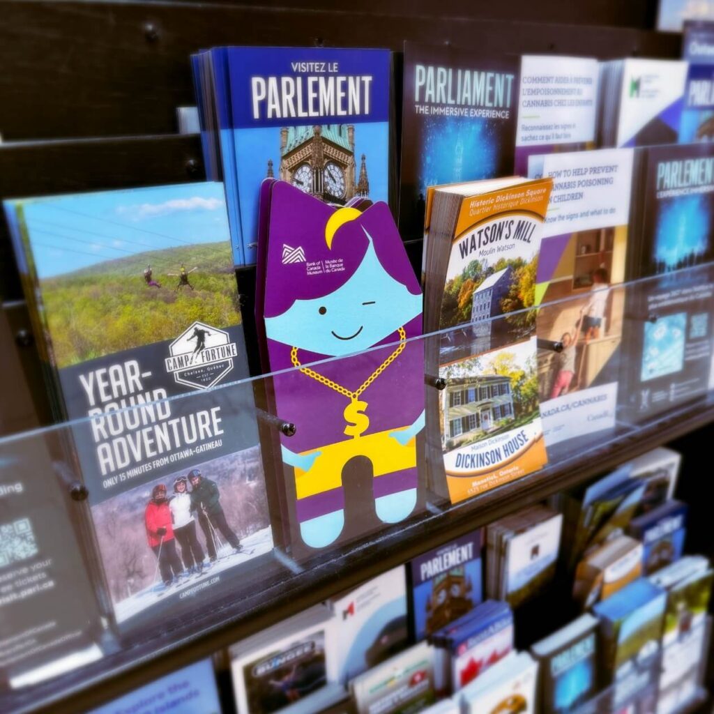
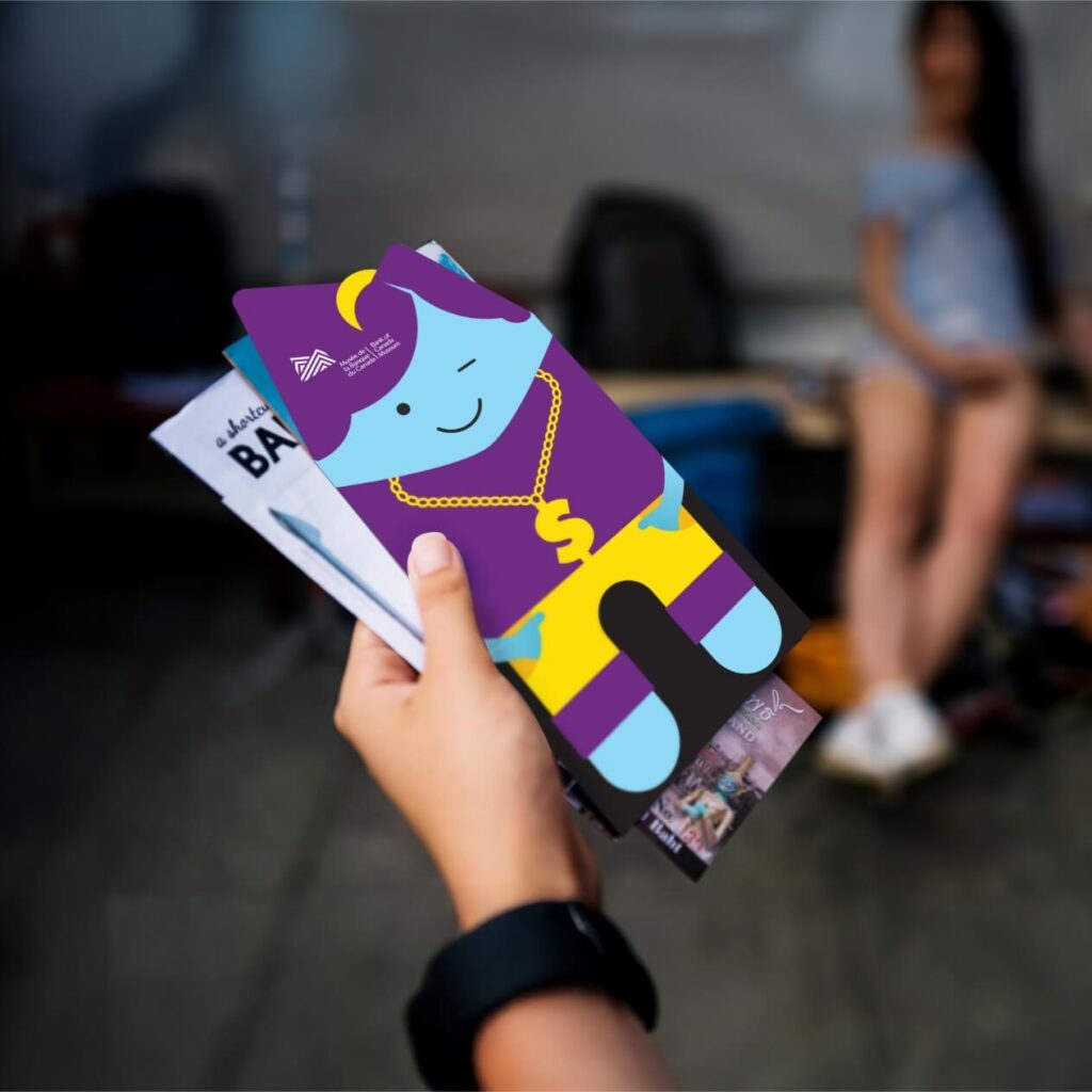
  • Custom rack card: Designed to stand out among traditional brochures, the piece mimicked the museum’s custom avatar system.
  • Photography: A full photo shoot captured visual assets used across digital and print.
  • Creative direction and copywriting: From scripting to positioning lines, we oversaw every detail to keep the tone playful and surprising.
  • Partner collaboration: We collaborated with House of Common for the photo and video work to capture the museum like never before.

The result? A bold campaign showing a different side of the museum without reinventing it. We simply amplified the story that was already there.

Come share it with us: how Canadian of Kingston

Strategy and execution

We leaned into country pride and common Canadian values, like hospitality and support for each other, a shared sense of belonging. We also layered in Kingston’s convenient location and its national significance—close to home with iconic landmarks and classic Canadiana culture.

Our city is your city

It’s more than a campaign slogan. It’s data-informed and emotion-driven. It’s an invitation to experience Kingston as a local and a Canadian. Not as a tourist. And it’s flexible, adaptive to different themes and messages based on traveller groups and their primary interests.

  • Media strategy blended traditional and digital, with geo and behavioural targeting plus digital retargeting linked to OOH
  • Targeted media placements spanned Ontario and Québec, including Toronto, Ottawa, and Montréal
  • From static to motion, each creative execution reinforced the warmth of Kingston’s character and its role as a cultural cornerstone
  • Every asset pointed to Tourism Kingston’s brand campaign landing page, where messaging and design were aligned for consistency
  • To ease financial concerns and incentivize bookings, travellers were offered a VISA gift card of up to $200 with select stay packages
laptop showing content of Tourism Kingston's campaign website

Results

The message is resonating, with more heads in beds, more foodies at tables, and more shoppers in shops. As of , the campaign is generating strong engagement and bookings, supporting recovery and driving visitors to Kingston.

0+

paid impressions

0+

paid link clicks

0+

site sessions

0% increase

in hotel referrals

A once-in-every-700-years kind of campaign

From getting more heads in beds and extending stays to attracting an audience interested in more than astral events. From bold branding and compelling creative, including digital ads and a custom landing page, to a meticulous media strategy. Here’s how we helped Tourism Kingston launch a campaign visitors will be talking about for another 700 years.

Creative strategy:
The colourful city

Tourism Kingston asked for a unique look and feel for the campaign. They wanted something different from other destinations in the path of totality. Something exciting and reflective of the event’s irregularity.

For the creative concept, we drew on Kingston’s essence as a youthful, vibrant city. Then harnessed the opposite of what most expect from a solar eclipse—an explosion of colour versus the contrast of light and dark. Finally, we leaned into our Digital Age, adding a tech twist to the design, like a glitch in the simulation. 

The branding needed to be easy to execute. For Tourism Kingston, their partners, and local businesses. It needed to be flexible, adaptable to digital assets, merch, and signage.

So we eclipsed the “o” in the Kingston wordmark and created a simple yet striking motif. It was easy for Tourism Kingston to swap the wordmark in existing assets, and a motif toolkit for the organization and its partners allowed for efficient execution.

Media strategy: aligning the sun and moon

Kingston wasn’t the only destination in the path of totality. But Toronto, Ottawa, and places along the 401 corridor weren’t. The media strategy targeted these markets, informing the primary audience of the solar eclipse and the festivities hosted in Kingston.

We focused on digital media to maximize reach. This also provided creative flexibility to the landing page and in-market ads. Following the campaign launch, programming, accommodations, and partner events continued to be updated—creative assets needed to quickly follow suit.

The campaign was aimed at two audiences:

  1. Potential visitors (primary), including those interested in astronomy and Kingston’s general target market. Messaging informed travellers that Kingston was in the path of totality and the city was hosting events leading up to and during the eclipse. It also encouraged potential visitors to book accommodations in advance.
  2. Kingston residents (secondary). Messaging focused on viewing areas around the city, all the events taking place, and the solar swag available. It was about taking pride in living in the destination and taking part in this once-in-a-lifetime event.  

Finally, we recommended a funnelled approach to the user journey. Digital ads and emails directed traffic to the solar eclipse landing page. Once there, the audience could learn about prime viewing areas in the city, events and programming, accommodations, and unique merchandise.

Minto Abbott’s Run

It started with a name.

Abbott’s Run is an ode to the first steam train to pass through Stittsville, the H.H. Abbott in 1870. This inspired the community positioning and visual identity, too, promising growth, connection, and wellness to potential homebuyers. A place that moves you forward.

To bring Abbott’s Run to life, we supported Minto on everything from the initial brand development through to street naming, land signage, web copy, and Sales Centre collateral. To strengthen the community’s identity, we shot original imagery and video in the surrounding area.

The go-to-market campaign built anticipation to generate and nurture leads. Tactics included digital and social media placements as well as radio flights, an email campaign, content creation, and out-of-home ads along major area roadways.

We worked with Minto to take a phased approach, updating our messaging and creative direction as sales dates solidified, building toward the grand opening.

Throughout it all, we made sure to communicate one of the most critical selling points: in a tight housing market, your options can feel limited.

In Abbott’s Run, there’s a perfect fit.

Sparking Conversations About the Energy of Tomorrow

With a new logo lockup and tagline, plus a new promotional strategy and redesigned landing environment, thinkenergy has the power to engage and educate listeners all across Canada. It stands out as a go-to source for change and innovation in the energy sector, while the brand’s connection to Hydro Ottawa reinforces trust and credibility.

Built for Better

With the Built for Better campaign, we prioritized the emotional promise behind a Minto home and community – a better place to live, work, and play. Then, we funneled users to discover the specific areas of the city in which they could live that promise.

To further support lead-gen, we also helped Minto tailor its messaging by pairing product types with audience segments – from first-time buyers to multi-generational families – to help everyone imagine a life in a Minto home.

Want to learn more about our work with Minto? View the full case study here.