Leading the Way: An Exploration of Typography
Let’s be clear about something right off the hop. I am not a designer, nor do I claim to be one. My design accolades include “Decently Proficient at Canva” and “Had to Take a Photoshop Course in University 14 Years Ago.”
Then why am I writing a piece on typography, you might ask? Because it’s something I’ve always been fascinated by, and it was an excuse for me to pick the brains of our art directors, Yang Li and Stephanie Chartrand, to ask them about the process of choosing a font or typeface—which aren’t the same thing—and how typography can impact brand awareness and recognition. And, because I’m a bit of a psychology nerd, I wanted to know some of the emotional and behavioural factors that play into typography and design in general.
So let’s take a journey through typography together. Maybe it’ll help you when considering fonts in the Futura.
(That’s a pun.)
What we’ll cover:
- What is typography?
- Wordmarks vs logomarks vs logos
- Influencers in the typography world
- How brands can leverage typography
- Considerations when choosing a typeface for a brand
- How does our team find and select typography?
What Exactly is Typography?
Typography is the art of taking letters or characters and arranging them in a legible, readable, and appealing way. It’s the style or the appearance of the text, not just the text itself.
“It’s everywhere,” Steph explains. “It’s web copy, it’s user interface, it’s product packaging, it’s logos. It’s anything and everything. That’s why it’s so important.”
Typography involves many different components like fonts, appearance, structure, and hierarchy to help tell a story through words on a page or screen. It also comes with its own set of jargon, like ascenders, descenders, tittles, serif, kerning and leading to name a few.
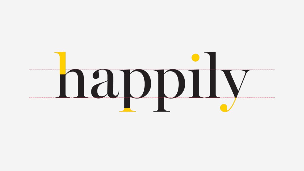
- X-height: the height of the lowercase letters that have no ascenders or descenders (more on this later), which indicates how tall or short the type appears. Fun fact: the height of the x in a given font is the literal x-height—that’s where the name comes from!
- Ascenders: the part of a lowercase letter that rises above the x-height
- Descenders: the part of a lowercase letter that sinks below the x-height
- Tittle: the small mark that sits over a lowercase i and j
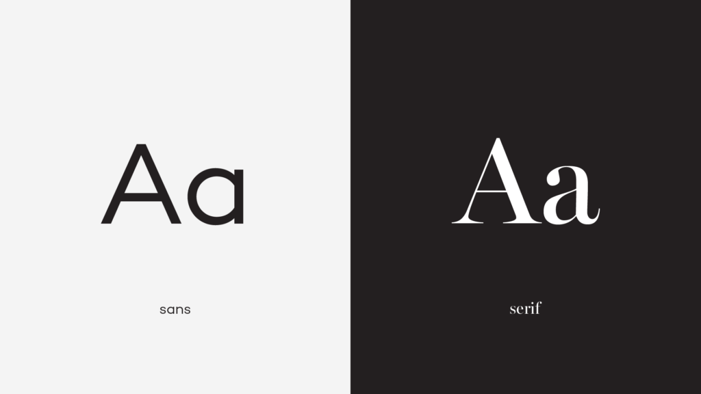
- Serif: the short stroke attached to or extending from the open ends of a letter’s shape, also a category of typefaces that use this design feature
- Kerning: the horizontal space between two consecutive characters
- Leading: the vertical space between lines of text
One of the biggest terminology misconceptions is that font and typeface are synonyms, but that’s not the case at all.
“People use typeface and font interchangeably, but they’re two different things,” Steph says. “A typeface is a family of fonts. Helvetica is a typeface. Helvetica Bold is a font.”
It’s nuanced, but all good things are. It’s what makes typography so impactful, even though most people won’t look at a piece of design and say “if only the kerning was narrower, I’d have really wanted to buy that patio set.” We may not even realize it as non-designers, but we respond better to good typography, so brands need to make sure they’re using it properly.
Wordmarks, Logomarks, and Combination Marks
Admittedly, we’re veering away from typography with this, but these definitions and differentiations are important when looking at the whole context of a brand.
This is often another case of mistaken identity, similar to font and typeface. Wordmarks, logomarks, and combination marks are all different types of logos. Also, to be clear, these terms all carry an element of nuance to them. It’s a scenario of “if you ask three different people, you’ll get three different answers,” but this is how we see it.
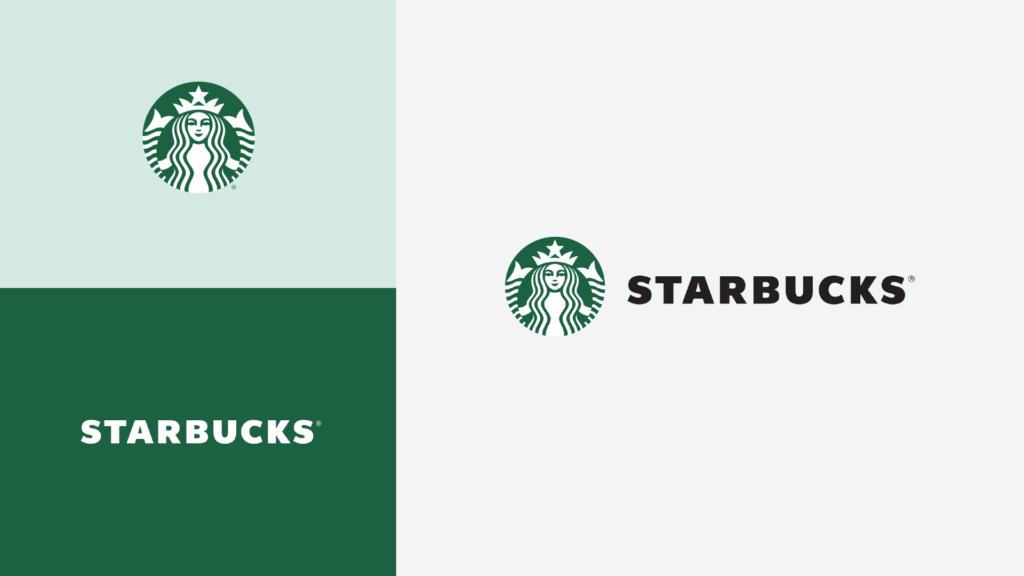
- Logo: a general term that refers to all marks representing a brand.
- Wordmark: a logo centred around a company’s name or initials (think Facebook or Google). These are also often referred to as logotype or lettermarks.
- Logomark: a logo centred around an image or icon (think Apple, or the late, Twitter.) These are also known as pictorial logos or logo symbols.
- Combination mark: a logo that combines both a wordmark and a logomark.
If we look at the examples above, the Starbucks mermaid is the logomark, the word “Starbucks” is the wordmark, and the combination of the two is the combination mark. A wordmark is a logo, but a logo doesn’t just refer to a wordmark.
Nowadays, brands often have multiple logo variations (variable, even responsive logo design), to ensure their logo appears at its best no matter where it appears. For example, the same company might use a wordmark for their email letterhead, a logomark for the corner of their mobile website and a combination mark for a giant street billboard. By having multiple logos, you can select the best one for wherever you put them, that flexibility is important.
Influencers in the Typography World
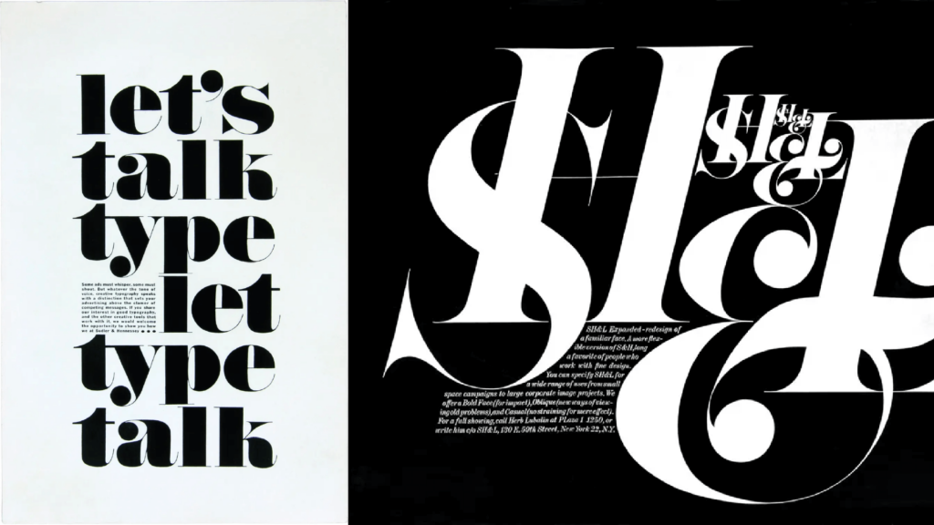
Yes, typography has influencers. Major ones, in fact. It’s impossible to have a conversation about typography without mentioning Herb Lubalin, a revolutionary mind that changed how designers approached typography through a style he called “graphic expressionism.”
According to Lubalin graphic expressionism is, “the use of typography or lettering as a creative means of expressing an idea, to elicit an emotional response from the viewer…and not just a mechanism for assembling letters on a page.”
There’s also Neville Brody, who is known for pushing the boundaries between typography and graphic design. Considered to have a “DIY-approach” to design, Brody’s work opened the door for digital type design, as he designed his own typefaces and, in 1990, founded the FontFont typeface library with Erik Spiekermann. To Brody, typography is a medium for “commenting ideas, and so [it] should be expressive and entertaining.”
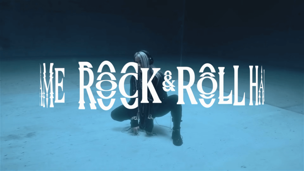
Expressive, entertaining, emotional. The “three Es”, if you will. They’re the guidelines brands should be following when considering and creating typography. Publications like Rolling Stone, Wired, and Fast Company continue to push the envelope with these three things in mind. Even Ray Gun, whose final issue was published in 2000, is still highly regarded when it comes to using typography in an innovative way.
So how can brands learn from these influencers and publications when using typography for their own brands? Not everyone needs to push the envelope. But a little nudge never hurt anyone.
How Brands Can Leverage Typography to Strengthen Their Message
At its core, typography impacts how people emotionally connect with a brand. It gives them an immediate inkling of what to expect. If you see a wordmark done in Comic Sans, you know (or at least you hope) it’s going to be light and casual. By the same token, if you see a wordmark for an insurance company done in Comic Sans, you might decide to look somewhere else because that wordmark comes across as lacking professionalism. It often feels like a gut instinct, right? But that “gut instinct” is actually being persuaded by typography.
“Typography is part of how you consume a brand, both visually and from a messaging perspective,” Yang explains. “It plays a role in evoking an emotion in the brand. If you pair that typeface with a certain colour, it’s going to make you feel a certain way. It can convey a message through form, shape, and style, as opposed to the actual copy on an ad which directly communicates something. They’re both type, but they’re used in completely different manners.”
Emotional decision making has a huge role to play in brand strategy, and specifically on design. Did you know people process visuals 60,000 times faster than they process text? If you’re creating a logo, it needs to visually captivate people before they even read the words. It’s why using typography correctly is so crucial. You don’t want to be knocked out of consideration before you even begin.
“We see logos everyday,” Yang says. “But many brands use typography incorrectly. It’s a balancing act between clarity and portraying the feeling of a brand. I’ve seen so many logos where it’s almost illegible. The feeling is there, but you can barely read what it says.”
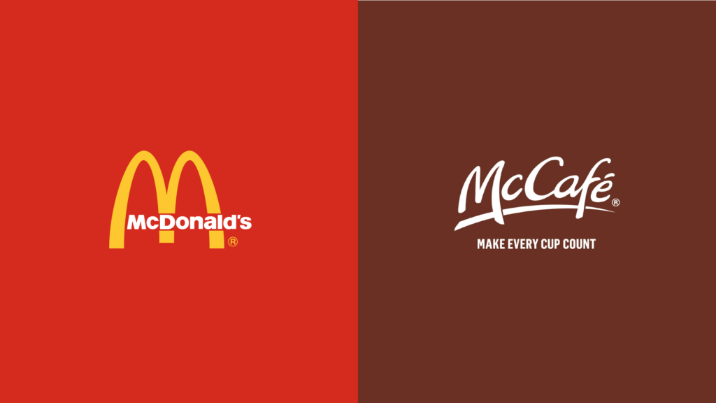
Let’s look at McDonald’s, for example. One of the most famous logos in the world. When you boil it down, it’s quite a simple execution. It’s synonymous with fast service and convenience and, when used consistently, it’s memorable and iconic.
But when McDonald’s wanted to move into the “higher end” café space, serving baked goods, coffee, and pastries, they had to make a shift. Their classic red-and-yellow logo doesn’t scream “elevated, relaxing morning.” The McCafé logo uses a casual style, inspired by handwriting, which elevates the design without eliminating the approachable feel. It also mirrors its major Canadian competitor, Tim Hortons, and leverages that audience recognition for its own benefit.
You probably wouldn’t trust the standard McDonald’s logo to make you good coffee, the same way you wouldn’t trust the McCafé logo to make you a decent Big Mac. And that, in large part, is because of typography.

Typography is also a main component of a brand’s graphic language—no, not swearing or words you wouldn’t say around your parents. Think about iconic brands and how even just by looking at an advertisement or product, you can likely identify the brand without any logo, or in some cases without any colour. Take the above ads, for example. No colour, no logo. But you probably identified that they’re from an IKEA campaign based on the graphic language.
What’s important to remember about typography is that yes, typefaces and fonts are at the heart of it all, but it’s also about connecting type and imagery to create a full story for your audience to consume and remember. It should drive your narrative. It should evoke an emotion. It should make people remember who you are, and why they should care.
Considerations When Choosing a Typeface or Font
Just like how McDonald’s needed a new typeface for its sub-brand, the selection of the right typeface depends on what you’re trying to accomplish. The font that sits on a product card or instructional booklet might need to be different from one on your storefront sign. It all comes down to its purpose.
“If it’s something that’s functional, the attributes of the typeface may need to be different than if it was to strictly evoke an emotion,” Steph explains. “If it’s functional, it needs to be legible so you’d need to look at leading and letter spacing, and those types of things. If it’s used for a logo, that’s when you want the feeling and the emotion. Obviously legibility is still important, but how that typeface is going to make someone feel or how it conveys the message of the brand is a higher priority.”
“You need to know the brand positioning, the strategy, what we want to make people feel, our audience, all of that,” Yang adds. “But the root is the strategy. The end goal is to make something or choose something that matches the strategy.”
So where do you start?
“Scrolling through a bazillion typefaces,” Steph jokes. “There are certain typefaces that are overused because they’re good. They’re well-made, but everybody uses them. So if you want to stand out, you have to spend more time finding gems.”
Once again, it all comes back to the strategy.
“As an example, if you want to portray yourself as very institutional, academic, intellectual, you might want to go with a more serif vibe,” Yang suggests. “But if you’re high-tech and completely corporate, you might go with sans serif.”
“But there are so many subtle nuances that change how a typeface comes off,” Steph points out. “A slab serif is different from a traditional serif, so you can’t say all serifs make people feel this way or that. It all depends on attributes and style of a typeface.”
Our Process for Using Typography in Branding
Though scrolling through typefaces is a part of the process, that only happens after an intense amount of research to understand what the brand is, what the messaging framework is, and who the audiences are. It also means researching tangential influences, which may not seem as directly related to the brand, but can have an immense impact. There’s also an element of socialization and essentially mini-focus grouping. It sounds like a lot of moving parts. And that’s because it is.
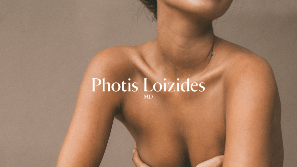
We’ll use our client, Photis Loizides MD, as an example. When Dr. Loizides came to us with a need for a new brand, Yang began researching different plastic surgery offices across North America and even as far as some European cities. What were some design consistencies among them? How did their branding make them appear (ego-driven, compassionate, business-like, sterile, etc)? Which offices were doing things in a way we found effective? Yang compiled all this research and presented it to the creative team for their reactions and feedback—or as we like to call it, “a gut check to make sure everything looks right.”
“Stress testing, socializing it, talking to people and asking what they see,” Yang explains. “That’s all part of the process.”
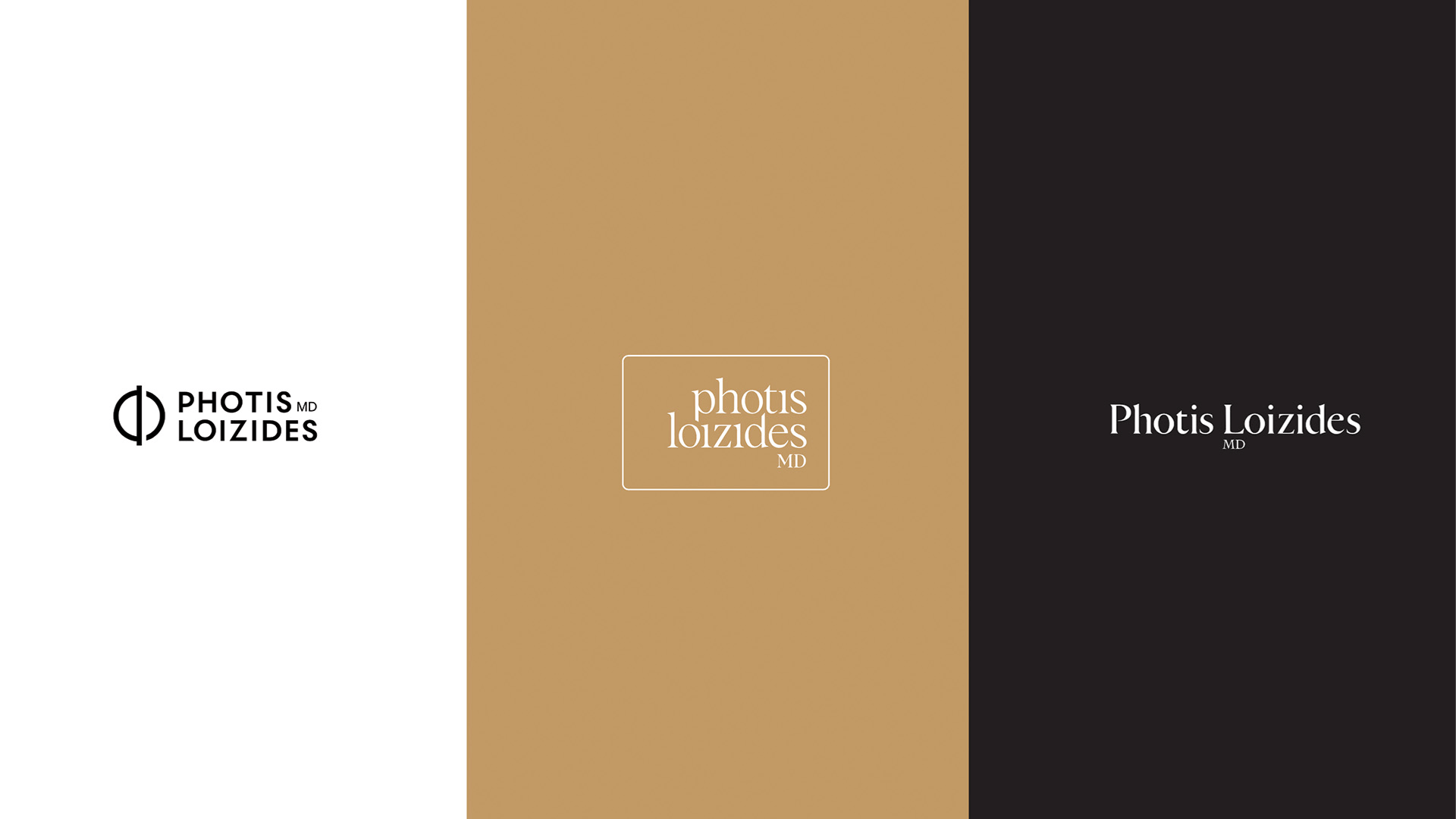
From there, Yang explored typefaces that reflected what he knew about the client and the overall strategy. It needed to feel trustworthy, elegant, and professional to mirror the business’ high-end reputation. During the initial stages of his brainstorming, Yang leaned into the Greek alphabet for inspiration. Dr. Loizides has Greek heritage, so this felt like a good entry point into the creative process.
“I think of how I come from a culture where our language is not phonetic,” he says. “It’s a pictorial language. So when I was playing with the Photis Loizides logo, I studied the Greek alphabet as part of the discovery and conceptualization phase to see if there was any way to draw inspiration. I always find that extremely interesting, because it’s portraying a feeling of a completely different language that’s not even phonetically based, but it’s making it feel like it is.”
After testing out typefaces that echoed the brand’s aspirations, Yang found one that was almost bang on. But when it comes to typography, good enough isn’t good enough. That doesn’t mean we need to create an entirely new font—that’s an extensive process that people make careers out of—but we can adjust an existing font to proprietize it and make it custom to our clients’ needs.
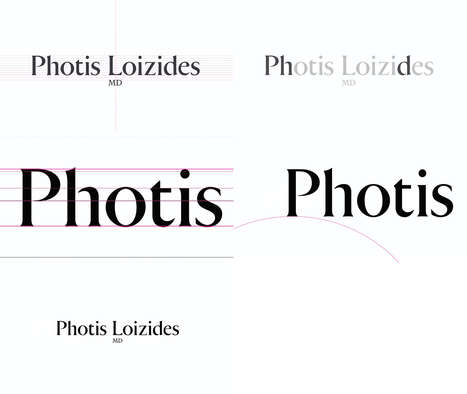
Yang took an existing font and recreated it for the Photis Loizides logo, changing elements as minute as the height of the serif on individual letters. When you hear it, you probably wouldn’t think it makes a difference, but when you see it, you can understand how a minor change makes a major difference. It didn’t change how someone physically reads the text, but it changed how they perceive it. It’s an added layer of effort that Yang always builds into his design process.
“Part of our job is to convey that feeling without losing the legibility and how people will consume it,” he says. “There’s a layer of love that goes into our work. It comes down to caring about those finer details. When you put that passion into your work, people notice.”
The conversation about typography could go on for days—weeks even! The intricacies, nuances, tactics, considerations, and psychology behind each element are endless, and they can change with every project. Though the fundamentals are the same, each project demands a unique approach to ensure the end result is exactly what it needs to be.
Curious to learn more about how typography can help your brand? Or better yet, ready to get started? Our team is ready to help you reshape and reimagine your brand’s typography executions from top to bottom.