Beyond the Features: What CONFIG Taught Us About Designing for Connection
This month, Yang and I tuned into Figma’s CONFIG, a global conference that brings together marketers, product designers, and developers to geek out over the latest trends and innovations in digital advertising and marketing tech.
It was our first time attending, and while we felt some serious FOMO for not being there in person (there was a lot of talk about the hallway booths—what did we miss?!), the virtual experience was still packed with amazing insights and inspiration.
We got the inside scoop on Figma’s shiny new launches—like Grid, Figma Make, and Buzz—all things we’re itching to try. Plus, we heard from some of the brightest minds in design.
Now, we’re pretty hyped about all the new tech (especially Grid!), but today, we’re skipping the product deep dive. Instead, we’re sharing some takeaways from the talks that really stuck with us—from the power of emotionally driven design to the enduring value of craft and the critical role trust plays in every interaction.
Why are these important for a brand? Well, you’re about to find out.

Emotionally driven design connects brands to people
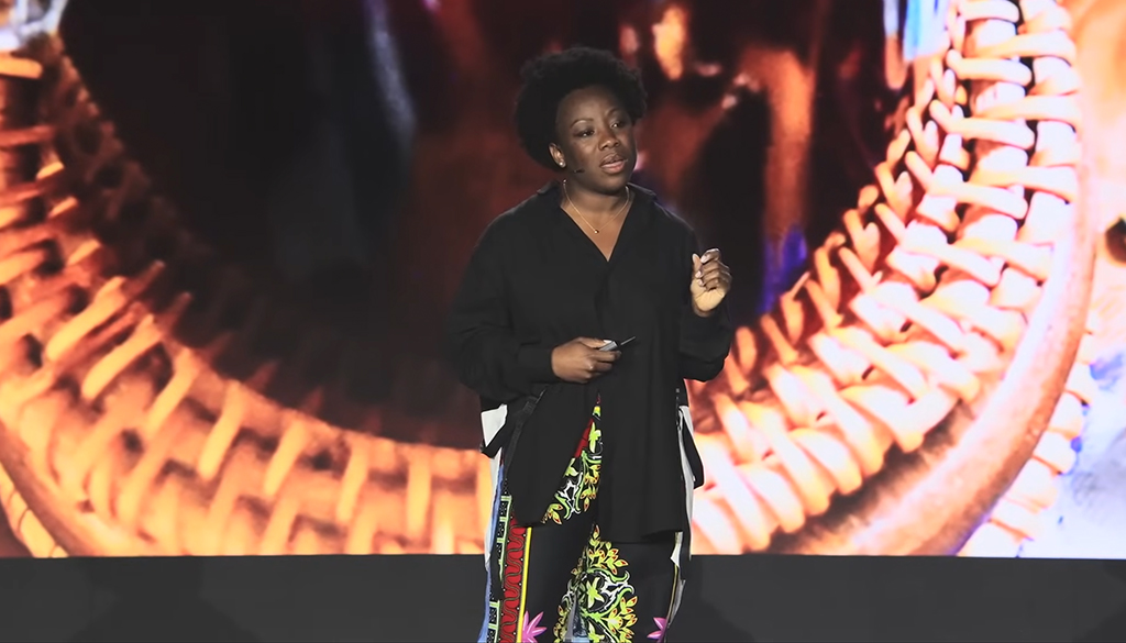
Ebi Atawodi, a product leader at YouTube who transitioned into filmmaking, shared a deeply personal journey. After learning about the architectural brilliance and cultural richness of The Kingdom of Benin—once one of the most advanced cities in the world—she created Zobo Studios, a platform for short films that celebrate West African art, history, and identity. Their mission was clear: to tell stories that inspire pride and preserve heritage.
Working in brand design and storytelling every day, we walked away (read: shut our laptops) from this talk with a clear reminder: great stories don’t just inform. They move people.
We live in an age where attention is short and trust is fragile. People have more choice—and more skepticism—than ever before. What makes someone stop scrolling, lean in, or share your brand’s message? It’s not just a polished visual or clever tagline. It’s emotion.
Emotion is what makes a message stick, and it’s what makes a brand feel human. As Ebi put it: Designing for emotion is how great products become loved. When people feel something, they connect. And that emotional connection is the foundation of lasting loyalty.
Whether we’re building campaigns, websites, or brand identities, the most impactful work we do as an agency happens when we lean into authentic storytelling—when we stop trying to sell and start trying to say something real. When we design for emotion.
It means going beyond demographics to truly understand your audience—their hopes, fears, and aspirations. It’s about building brands that don’t just appear, but stand for something meaningful. And at every stage—from high-level messaging to the smallest website interaction—it’s about asking, “How do we want people to feel when they engage with this?”
Ebi compared writing a screenplay to designing a user journey. Both require structure, empathy, and purpose. Each scene (or touchpoint) should carry emotional weight, and each detail—tone, pacing, design—should be intentional.
It’s a powerful analogy for brand storytelling. Think of your brand as the director of a story: You don’t act out every scene, but you guide the experience. The magic happens when your audience feels like they’re part of the story, not just watching from the sidelines.
That’s the shift we see in marketing today. The best brands aren’t louder—they’re more meaningful. They tap into emotion to build connection, community, and conversation. Because people don’t build relationships with features; they build them with feelings.

Craft still matters in the age of AI
Karri Saarinen, co-founder of Linear, and Inga Hampton, a product designer at Raycast who “makes over complicated art on Figma” (her words), both touched on something we don’t hear enough about these days: craft.
With businesses rushing to automate, scale, and lean on AI, it’s easy to get caught up in speed and efficiency. Sure, those things matter—they help teams move quickly and do more. But here’s the thing: speed doesn’t stick. What people truly remember is quality. The care behind the experience. The thoughtfulness in every detail.
Karri put it perfectly: Quality is a choice. He pointed out that companies often drop quality not because it’s unimportant but because it’s hard to measure. Instead, they chase what they can count—clicks, conversion rates, time to market—and lose sight of what actually builds trust and keeps people coming back.
We’ve seen this firsthand at our agency. The projects that make the biggest impact—the ones people talk about and share—aren’t just the fastest or most efficient. They’re the ones crafted with care and designed to truly reflect what a brand stands for.
That’s not to say AI doesn’t have a role. Far from it! Tools like generative design, smart automation, and AI-assisted workflows are helping us move faster and explore more ideas than ever before. But they’re just that: tools. The real magic still comes from people—from teams who care deeply about the work and who are willing to put in the effort to make something that feels just right.
The best results don’t come from shortcuts or chasing every trend. They come from doing the hard, human work: understanding your audience, refining your message, and creating experiences that truly resonate. In a world where almost anything can be generated in seconds, it’s the details that make all the difference.
And in those details—in the craft—is where brands really stand out.

Trust is the most important thing we build
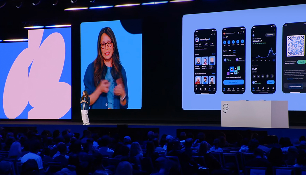
Jude Sue—a product designer whose career has taken her from Instagram to Coinbase and now World Labs—shared an insight that stuck: when we design products or experiences, what we’re really designing for isn’t features or flash. It’s trust.
That’s especially striking coming from the world of brand and advertising, where so much of our work focuses on campaigns, visuals, and messaging. But at its core, what we help clients build is trust. When a brand shows up consistently, communicates clearly, and delivers on its promises—people start to believe. And, over time, that belief builds loyalty.
Trust is vital not only between brands and customers but also between agencies and clients. It creates room for honest conversations, bold ideas, and pushing boundaries. Awards are nice, but a strong, trusted relationship is what earns the next opportunity.
Jude’s examples say it all— from how Uber made it normal to hop into a stranger’s car and just trust the vibes, to how Airbnb built trust between two people who’ve never met (and are now sharing a bathroom), to the subtle, confidence-building cues in tools like ChatGPT and Claude. Together, they underscore a simple truth: good design doesn’t just look good—it makes people feel safe enough to say “yes.”
For us, this means helping brands build trust through clear messaging, thoughtful design, and consistent experiences. But that kind of work can only happen when there’s trust on both sides. It’s not blind faith—it’s transparency, reliability, and commitment. When that trust is in place, everything flows better. The work improves, and so do the results.
Jude summed it up best: trust isn’t just a vibe—it’s built day by day through consistency. This applies as much to product UIs and flows as it does to brand voice and agency partnerships. When everyone is aligned and confident in the path forward, it shows in the work.
Designing for what really matters
Great design and branding are really about people. It’s about sparking real emotions, respecting the craft in every little detail, and building trust that sticks around.
With technology moving at lightning speed and attention spans getting shorter, these timeless truths keep us grounded, and keep us focused on what truly matters—making work that feels honest, thoughtful, and meaningful.
Because when we do that, brands don’t just catch eyes—they build real, lasting connections. And honestly, that’s the kind of impact worth chasing.
At Alphabet® we have decades of experience helping brands build trust and connections that stand the test of time. Ready to be the next one? Reach out today.


