CTA: Great Taste of Canada

“Alphabet®’s collaborative process and invaluable guidance ensured the final outcome not only met but exceeded our expectations.”

Nicole Brown, VP of Operations and Partnerships, Culinary Tourism Alliance

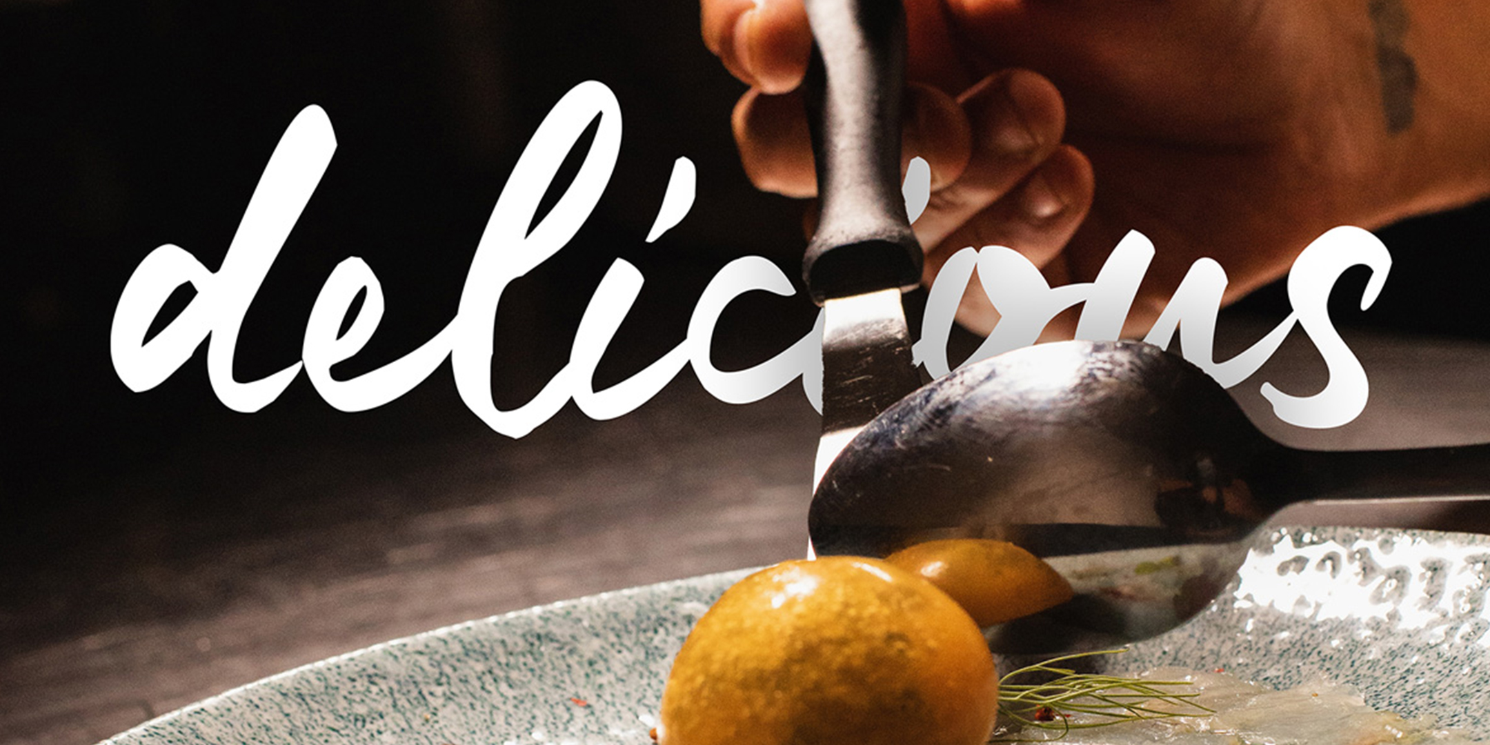
Homegrown flavours and homegrown cultures. Passion and wanderlust. These are at the root of food tourism, so we planted each seed in the Great Taste of Canada brand.

After unearthing the Great Taste of Canada brand, we created an easy-to-follow guide for CTA’s marketing team. The brand guide offers best-practices for the logo and motifs, colour palettes and typography, marketing applications and ad templates. 
Great Taste of Canada is the centrepiece. CanadaCulinary.com is the harvest table. This dynamic content hub supports the Culinary Tourism Alliance’s on-going programs and new initiatives, while promoting the nation’s culinary stories and taste of place experiences. 

From wireframing to coding to creating an interactive map and a sizzling UX. We delivered a custom-built solution with the power to adapt as CTA continues to amplify agritourism across Canada. 

A media strategy, leveraging mobile-first advertising through Native Touch, was also recommended to reach foodies and food-connected travellers in Canada.
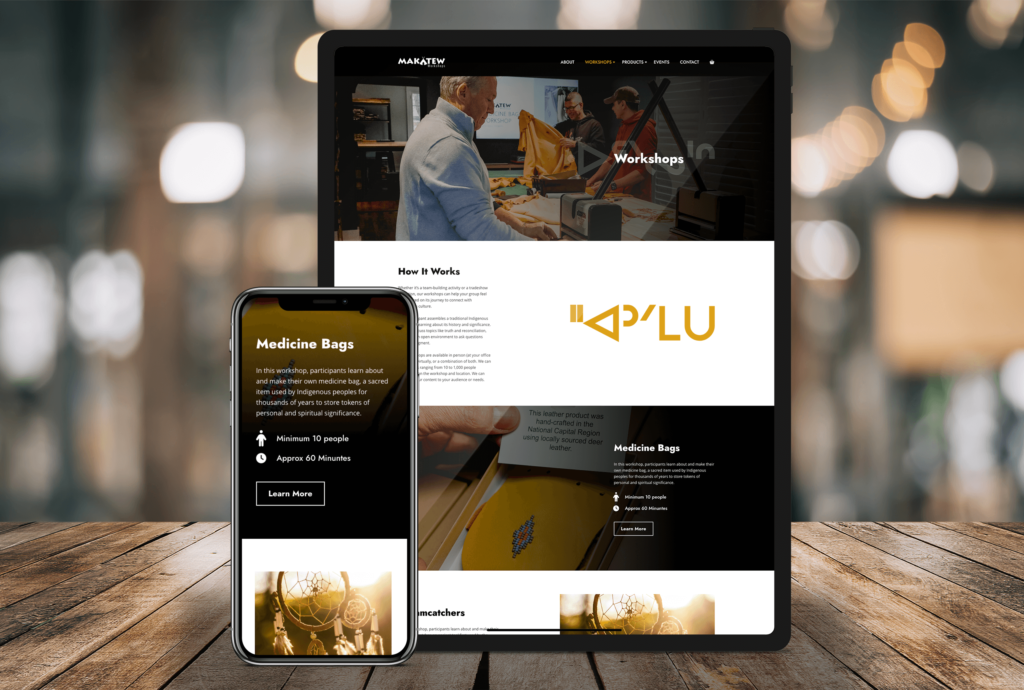
Makatew Workshops

For users, the new website makes it easy to navigate Makatew’s products and services. It highlights the real benefits of hiring Marc, from education to reconciliation.

For Marc, the website simplifies some of his core operating functions, including the ability to promote new workshops and products, capture new leads, and list and manage events at his beautiful new facility in Carp.

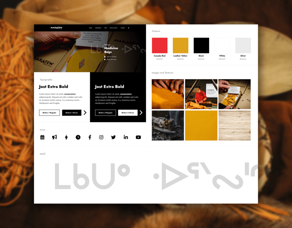
Lastly, the site breathes life into the Makatew brand beyond just a logo. Through intentional design elements like typography, photography, iconography, colours, and Cree Syllabics as texture words, the site exudes an identity that’s truer to Marc’s.

Giving Life to CryoStasis

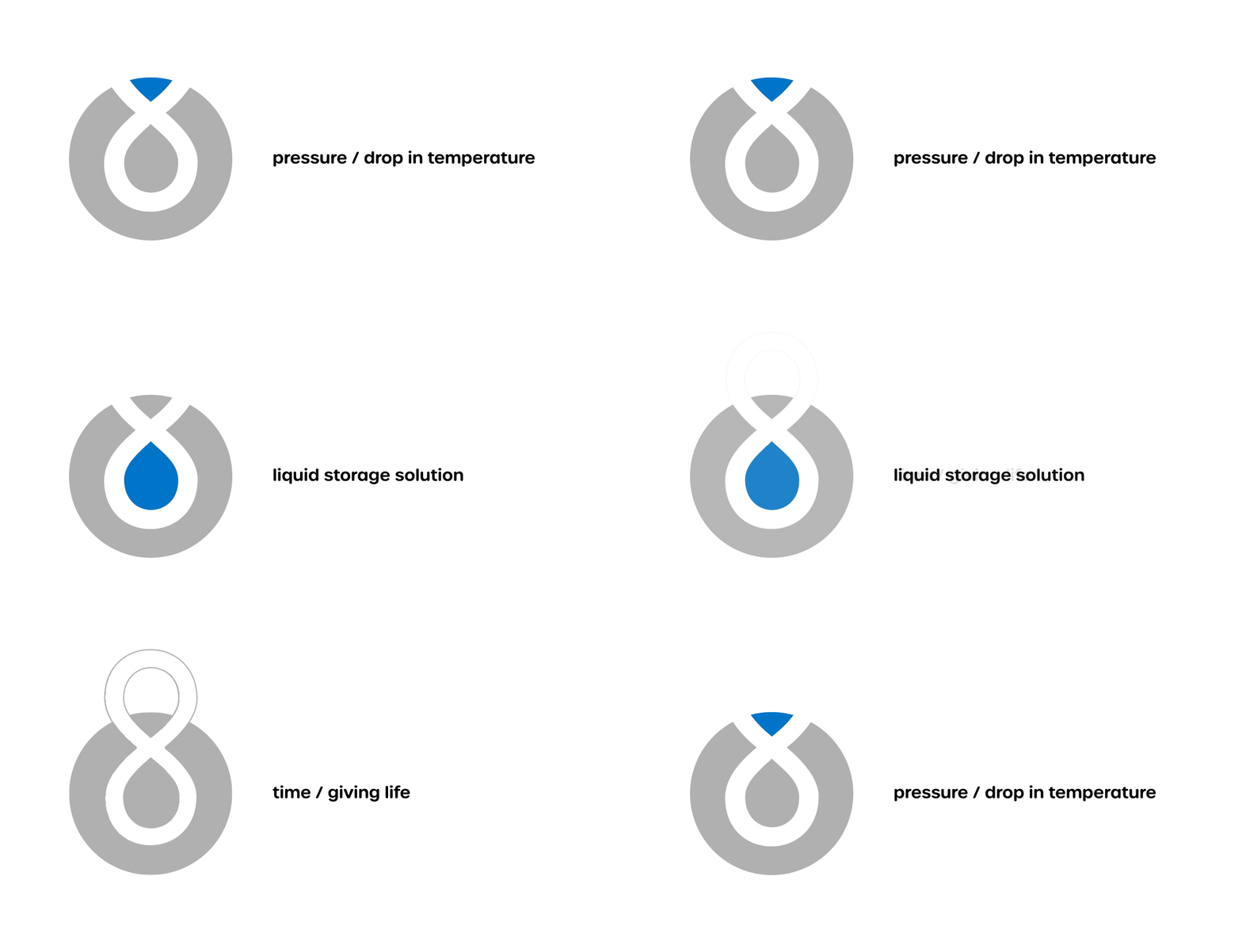
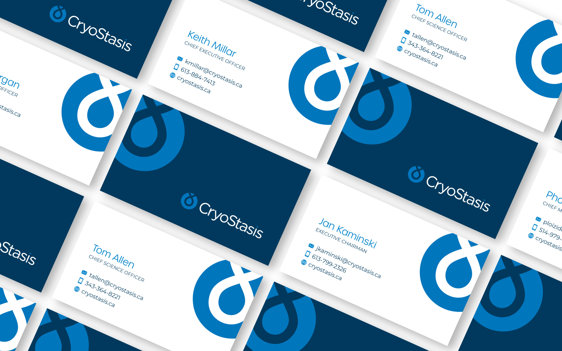
The CryoStasis logo is an ode to the company’s cold chain management process, which combines temperature, pressure, and liquid storage systems to safely preserve biological material for an unheard of length of time.

Writing and designing the new website was a delicate balancing act. It was important to respect the fact that an overly embellished brand or overt marketing messages weren’t likely to resonate with the medical community. The final product establishes credibility but gets out of its own way. It lets the science speak for itself, all while toeing the line between the technical and aspirational.

Elevating Canadian Experiences

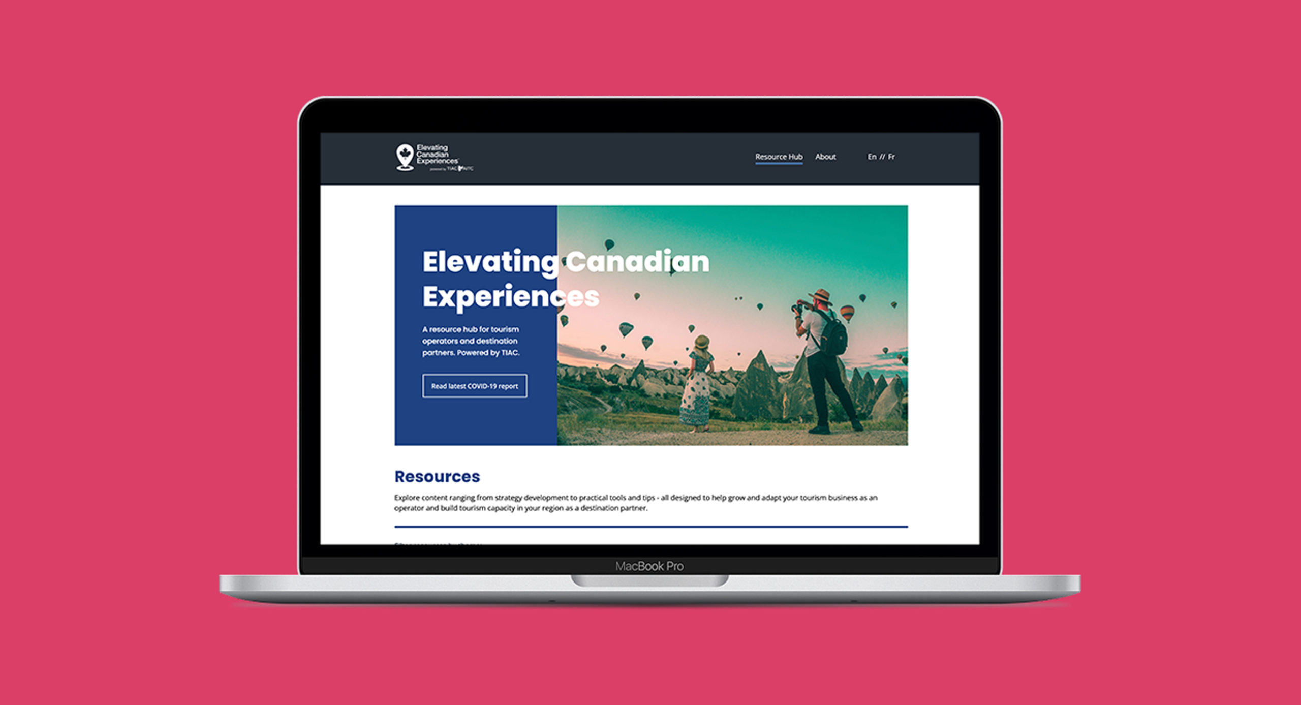
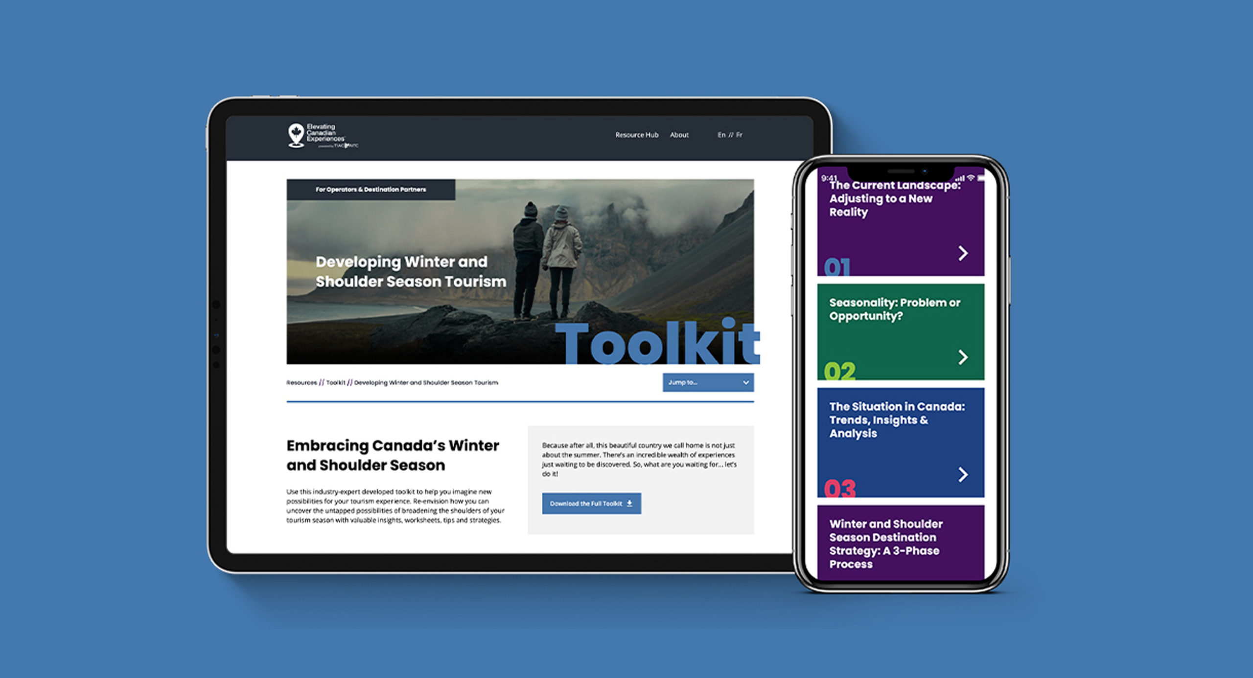
We built a custom, self-guided digital learning solution that translated disparate, region-specific content into interactive, easily accessible webinars that any tourism operator, anywhere in Canada, can benefit from.

We also gave TIAC and its industry partners design and content-creation guidance to build out complementary resources, including a set of national best-practice guidelines, a tourism development toolkit, COVID-19 tourism reports, and more.