A once-in-every-700-years kind of campaign

From getting more heads in beds and extending stays to attracting an audience interested in more than astral events. From bold branding and compelling creative, including digital ads and a custom landing page, to a meticulous media strategy. Here’s how we helped Tourism Kingston launch a campaign visitors will be talking about for another 700 years.

Creative strategy:
The colourful city

Tourism Kingston asked for a unique look and feel for the campaign. They wanted something different from other destinations in the path of totality. Something exciting and reflective of the event’s irregularity.

For the creative concept, we drew on Kingston’s essence as a youthful, vibrant city. Then harnessed the opposite of what most expect from a solar eclipse—an explosion of colour versus the contrast of light and dark. Finally, we leaned into our Digital Age, adding a tech twist to the design, like a glitch in the simulation. 
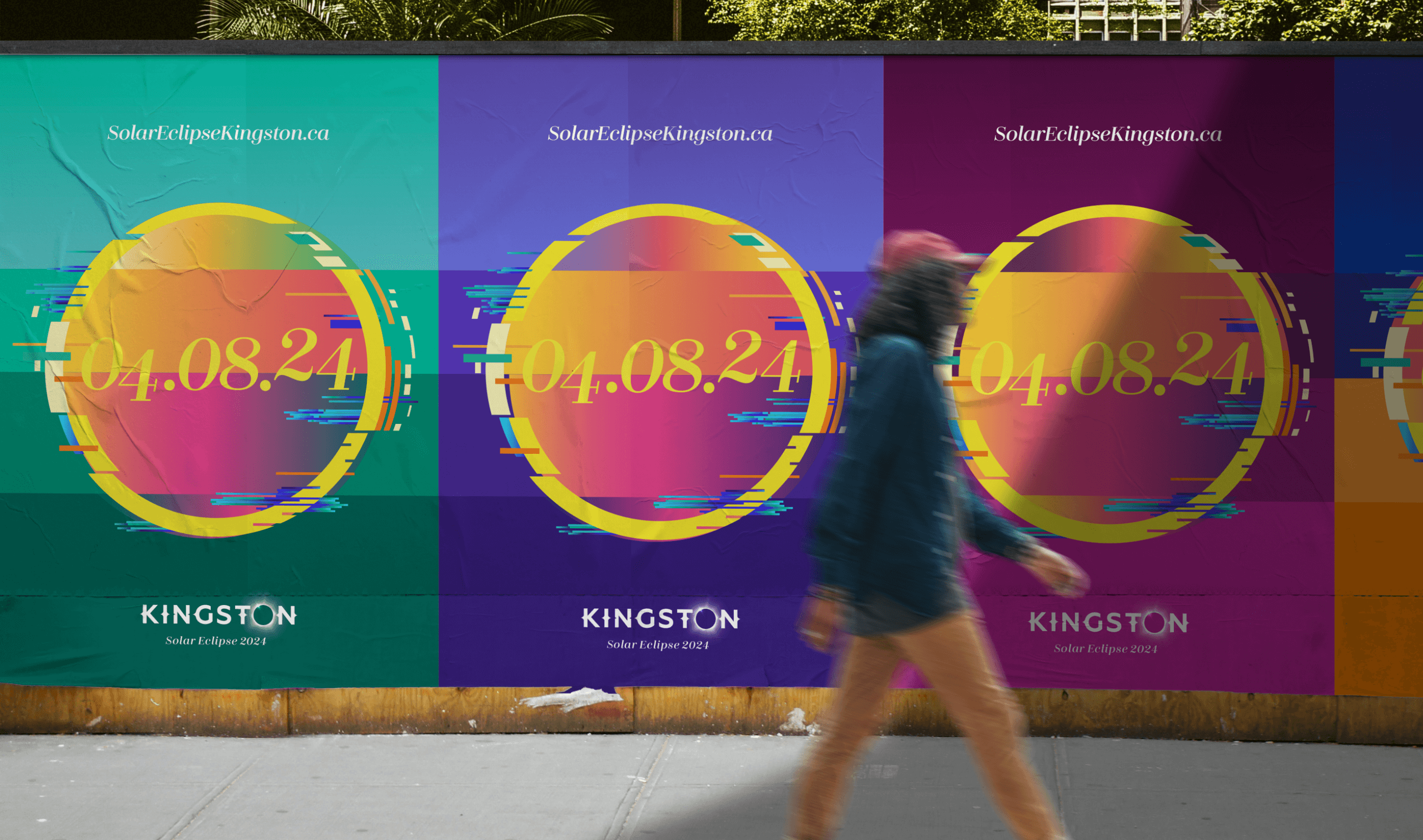
The branding needed to be easy to execute. For Tourism Kingston, their partners, and local businesses. It needed to be flexible, adaptable to digital assets, merch, and signage.

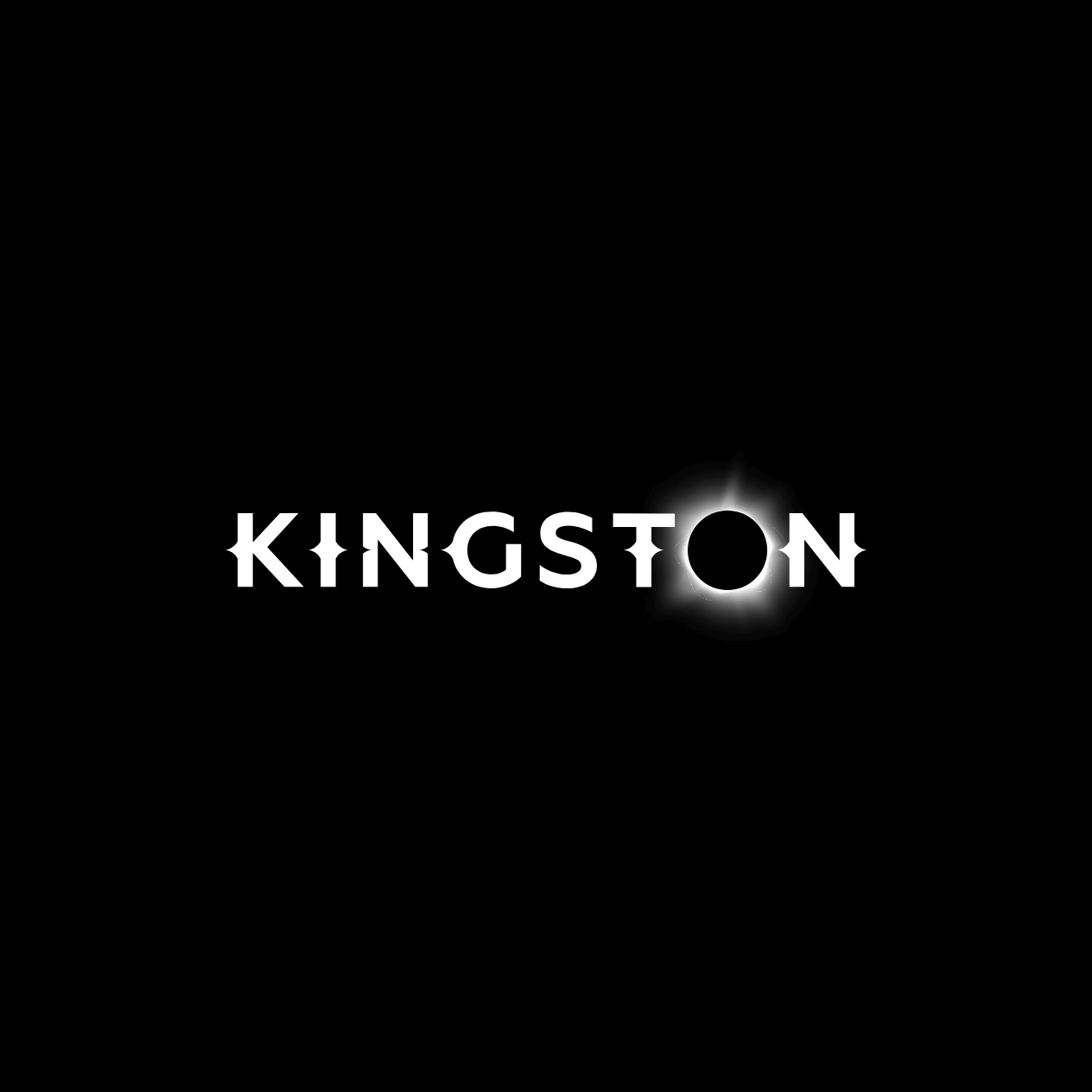
So we eclipsed the “o” in the Kingston wordmark and created a simple yet striking motif. It was easy for Tourism Kingston to swap the wordmark in existing assets, and a motif toolkit for the organization and its partners allowed for efficient execution.
Media strategy: aligning the sun and moon

Kingston wasn’t the only destination in the path of totality. But Toronto, Ottawa, and places along the 401 corridor weren’t. The media strategy targeted these markets, informing the primary audience of the solar eclipse and the festivities hosted in Kingston.

We focused on digital media to maximize reach. This also provided creative flexibility to the landing page and in-market ads. Following the campaign launch, programming, accommodations, and partner events continued to be updated—creative assets needed to quickly follow suit.
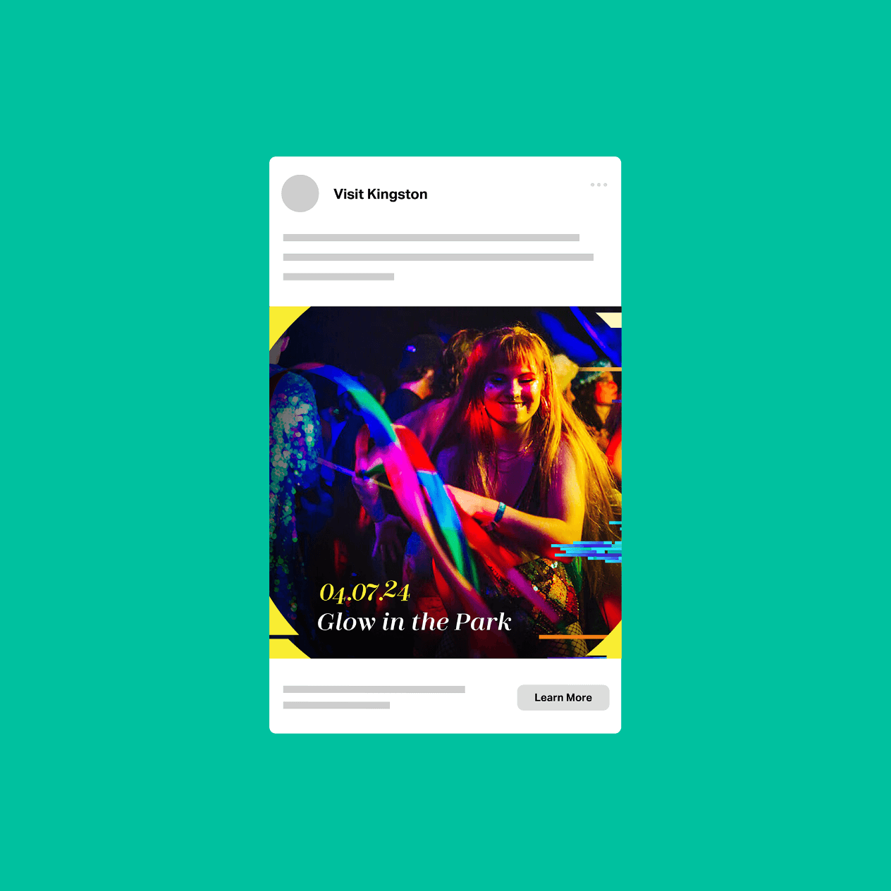
The campaign was aimed at two audiences:

  1. Potential visitors (primary), including those interested in astronomy and Kingston’s general target market. Messaging informed travellers that Kingston was in the path of totality and the city was hosting events leading up to and during the eclipse. It also encouraged potential visitors to book accommodations in advance.
  2. Kingston residents (secondary). Messaging focused on viewing areas around the city, all the events taking place, and the solar swag available. It was about taking pride in living in the destination and taking part in this once-in-a-lifetime event.  

Finally, we recommended a funnelled approach to the user journey. Digital ads and emails directed traffic to the solar eclipse landing page. Once there, the audience could learn about prime viewing areas in the city, events and programming, accommodations, and unique merchandise.
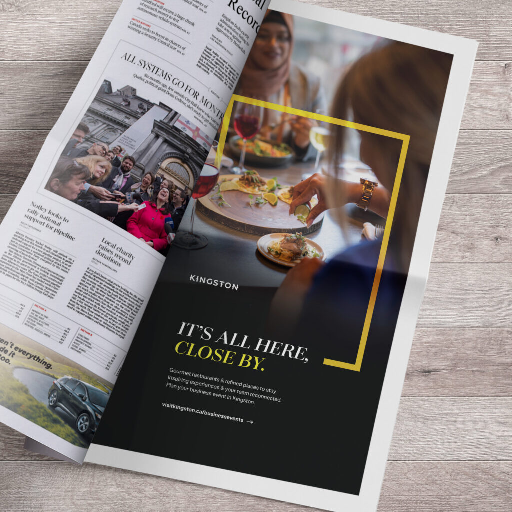
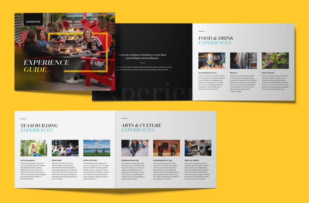
Taking Care of Business: Supporting Tourism in Kingston with Corporate Travel

Reconnect in Kingston

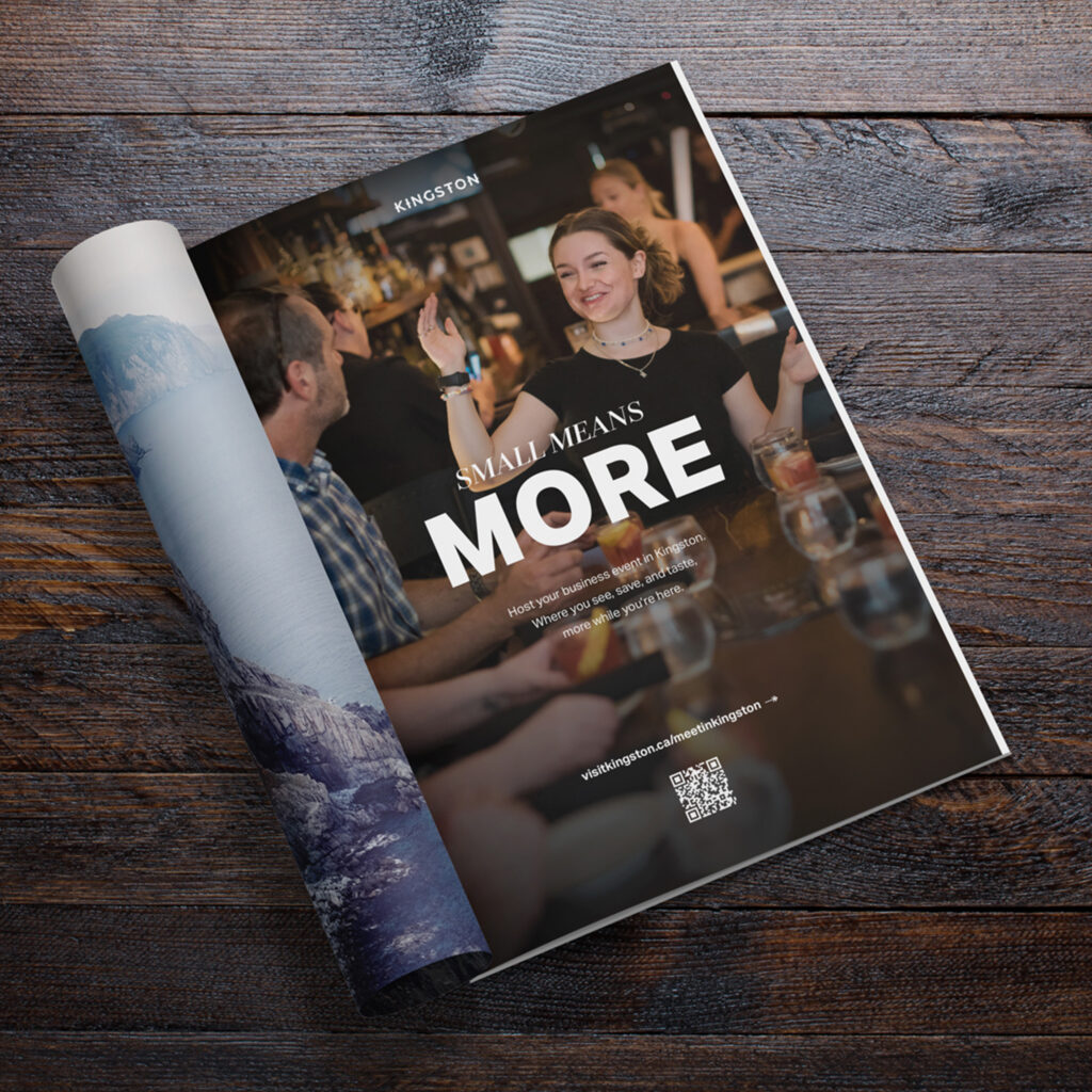
Phase 1 of the campaign emphasized the value of in-person meetings amidst virtual fatigue and the need for genuine connection. Research showed fully remote events lacked impact, affecting businesses’ culture and creativity.

Messaging played off these pain points, urging small-to-medium businesses (SMBs) to reconnect in real life. To go from online to real time, muted mics to live nights, and from emails to shared meals.

“Alphabet® really gets tourism in Kingston. The business events campaign was big-picture and creative. But it was also strategic and easy to execute.”

Ted Robinson, Business Events Specialist, Tourism Kingston

The power of small

By 2024, the benefits of in-person events were clear. But budgets for business event planners remained flat, so more economical meetings were being prioritized. Research also uncovered sustainability as an important factor of the decision-making process—not just environmentally but culturally and economically, as well. To align the campaign, its creative concept and messaging needed to evolve. 

In phase 2, we focused on Kingston’s advantage over larger destinations—its size. The ability to see more, do more, and taste more while in the city. How an accessible, walkable, and forward-thinking destination was budget friendly, travel friendly, and culture friendly. And how it all connects to sustainability.

Playing matchmaker with market and media

The campaign launched when large-scale events were limited, budgets were cut, and virtual meetings were the default. But SMBs were forecasted to return to in-person events. Specifically, small gatherings in less expensive and less urbanized cities. Kingston’s size, intimate venues, and location between Montréal, Ottawa, and Toronto made it an attractive destination. The city’s future conference centre and wealth of tourism offerings added to its appeal. 

To keep Kingston top of mind, the campaign was amplified by a targeted media plan, speaking directly to event planners and CEOs through business-specific channels and content partnerships. Traffic was funneled to a landing page, where the advantages of hosting in Kingston were highlighted alongside an experience guide and trip inspiration.

Kingston’s Business Events Specialist, Ted Robinson, was central to the landing page, reinforcing the value of human connection. The call to action made it clear Ted was responsible for helping plan and book a business’s event in Kingston.

“Sustainable tourism is a priority but it’s about more than ‘green-ness’. Alphabet® gets that and thinks long-term. That’s why the business events campaign was impactful.”

Ted Robinson, Business Events Specialist, Tourism Kingston

CTA: Great Taste of Canada

“Alphabet®’s collaborative process and invaluable guidance ensured the final outcome not only met but exceeded our expectations.”

Nicole Brown, VP of Operations and Partnerships, Culinary Tourism Alliance

Homegrown flavours and homegrown cultures. Passion and wanderlust. These are at the root of food tourism, so we planted each seed in the Great Taste of Canada brand.

After unearthing the Great Taste of Canada brand, we created an easy-to-follow guide for CTA’s marketing team. The brand guide offers best-practices for the logo and motifs, colour palettes and typography, marketing applications and ad templates. 

Great Taste of Canada is the centrepiece. CanadaCulinary.com is the harvest table. This dynamic content hub supports the Culinary Tourism Alliance’s on-going programs and new initiatives, while promoting the nation’s culinary stories and taste of place experiences. 

From wireframing to coding to creating an interactive map and a sizzling UX. We delivered a custom-built solution with the power to adapt as CTA continues to amplify agritourism across Canada. 

A media strategy, leveraging mobile-first advertising through Native Touch, was also recommended to reach foodies and food-connected travellers in Canada.

Minto Abbott’s Run

It started with a name.

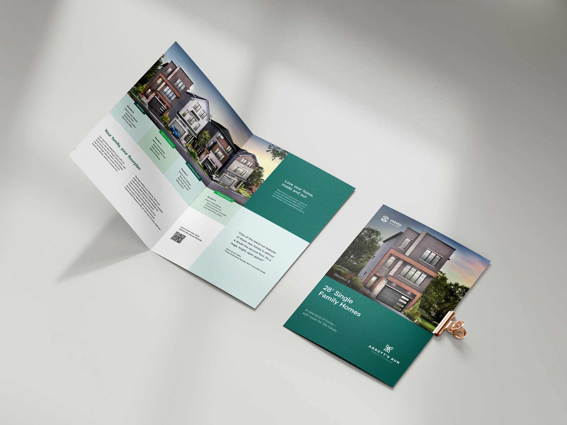
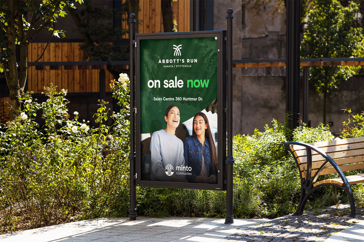
Abbott’s Run is an ode to the first steam train to pass through Stittsville, the H.H. Abbott in 1870. This inspired the community positioning and visual identity, too, promising growth, connection, and wellness to potential homebuyers. A place that moves you forward.

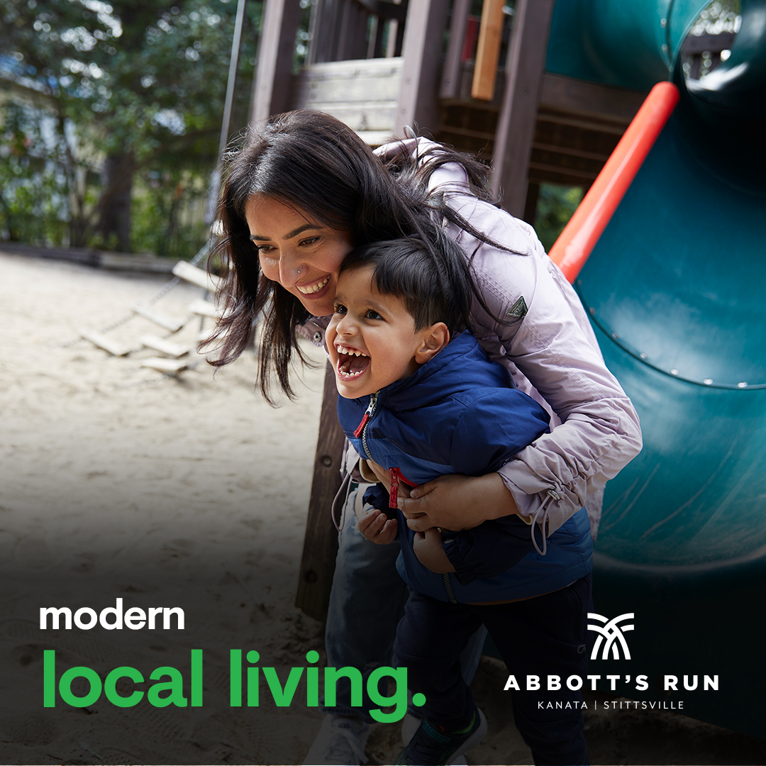
To bring Abbott’s Run to life, we supported Minto on everything from the initial brand development through to street naming, land signage, web copy, and Sales Centre collateral. To strengthen the community’s identity, we shot original imagery and video in the surrounding area.

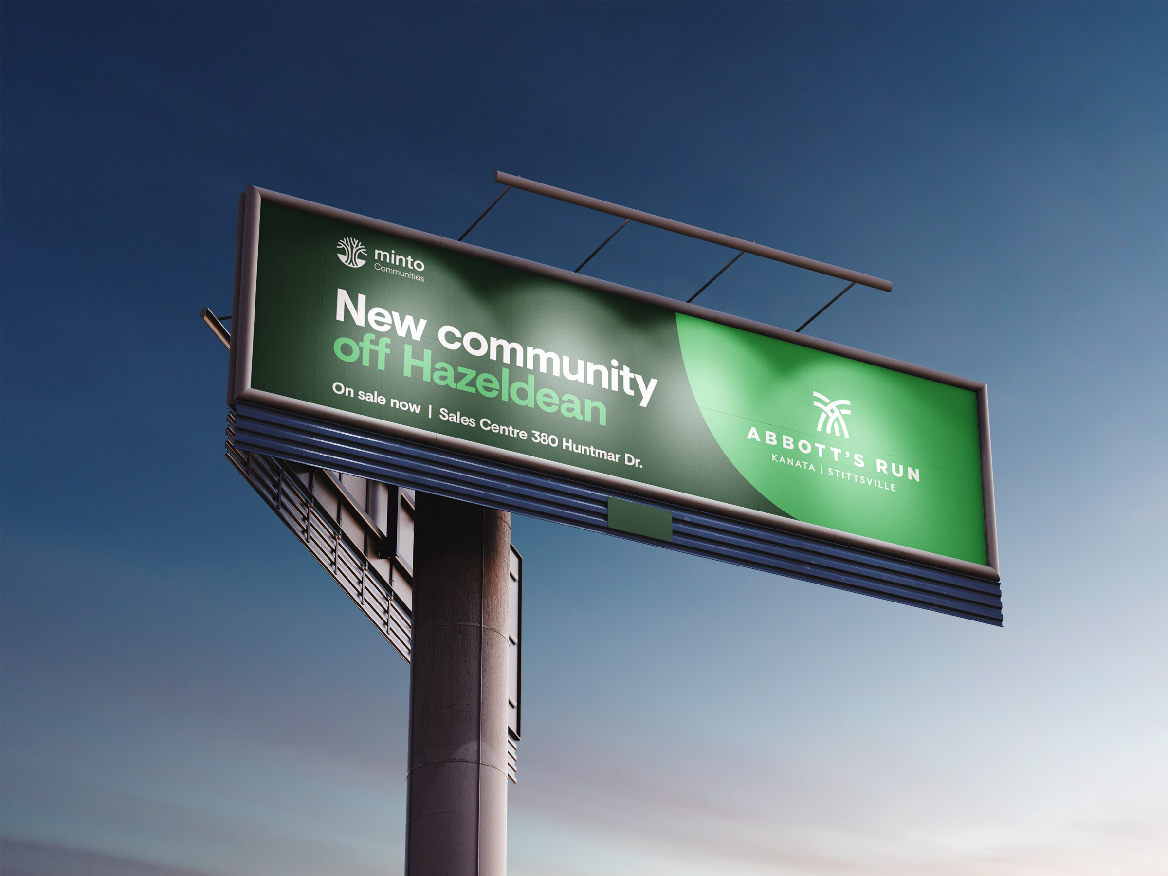
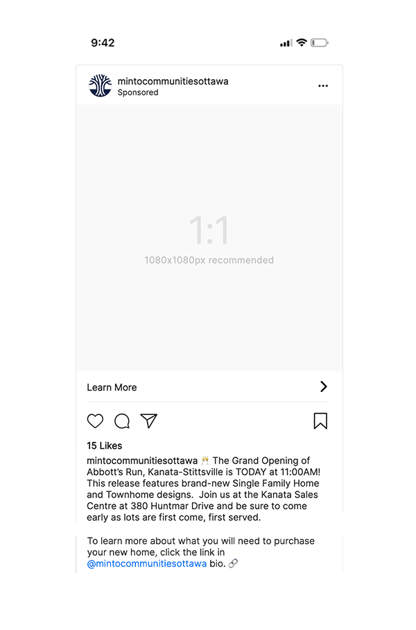
The go-to-market campaign built anticipation to generate and nurture leads. Tactics included digital and social media placements as well as radio flights, an email campaign, content creation, and out-of-home ads along major area roadways.

We worked with Minto to take a phased approach, updating our messaging and creative direction as sales dates solidified, building toward the grand opening.

Throughout it all, we made sure to communicate one of the most critical selling points: in a tight housing market, your options can feel limited.

In Abbott’s Run, there’s a perfect fit.

Sparking Conversations About the Energy of Tomorrow

With a new logo lockup and tagline, plus a new promotional strategy and redesigned landing environment, thinkenergy has the power to engage and educate listeners all across Canada. It stands out as a go-to source for change and innovation in the energy sector, while the brand’s connection to Hydro Ottawa reinforces trust and credibility.

Makatew Workshops

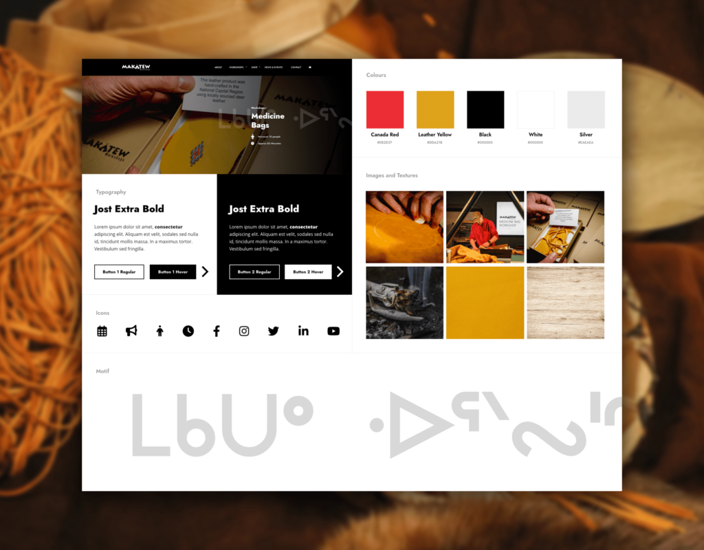
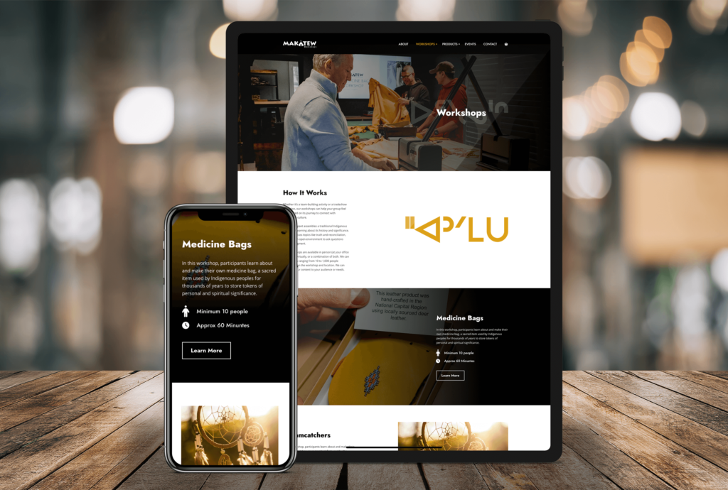
For users, the new website makes it easy to navigate Makatew’s products and services. It highlights the real benefits of hiring Marc, from education to reconciliation.

For Marc, the website simplifies some of his core operating functions, including the ability to promote new workshops and products, capture new leads, and list and manage events at his beautiful new facility in Carp.

Lastly, the site breathes life into the Makatew brand beyond just a logo. Through intentional design elements like typography, photography, iconography, colours, and Cree Syllabics as texture words, the site exudes an identity that’s truer to Marc’s.

Giving Life to CryoStasis

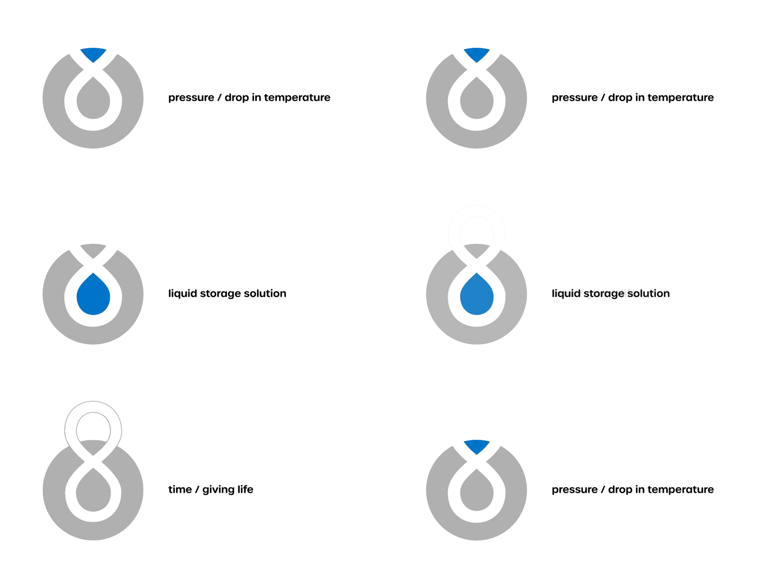
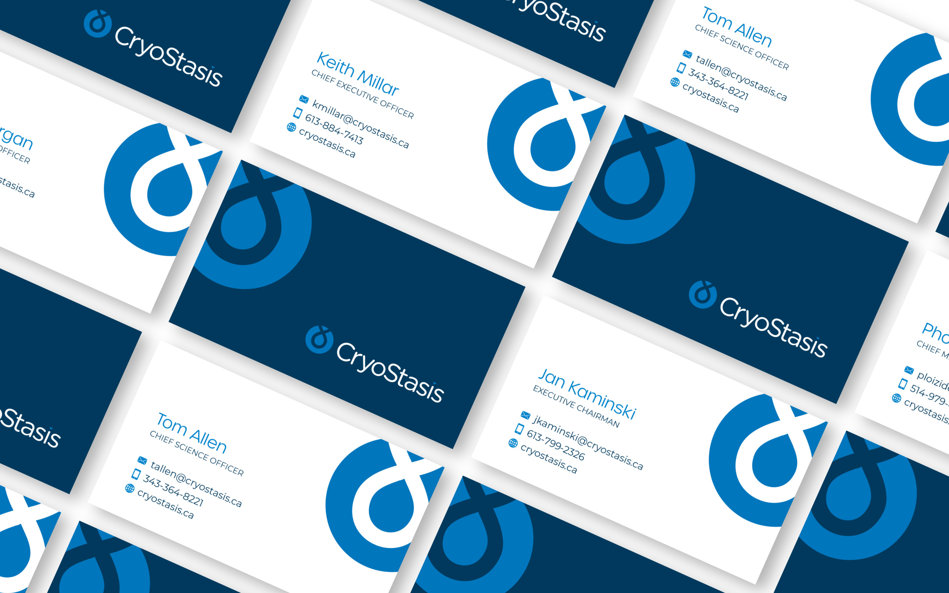
The CryoStasis logo is an ode to the company’s cold chain management process, which combines temperature, pressure, and liquid storage systems to safely preserve biological material for an unheard of length of time.

Writing and designing the new website was a delicate balancing act. It was important to respect the fact that an overly embellished brand or overt marketing messages weren’t likely to resonate with the medical community. The final product establishes credibility but gets out of its own way. It lets the science speak for itself, all while toeing the line between the technical and aspirational.